Thursday, July 25th, 2013
LAYOUT: Home Page
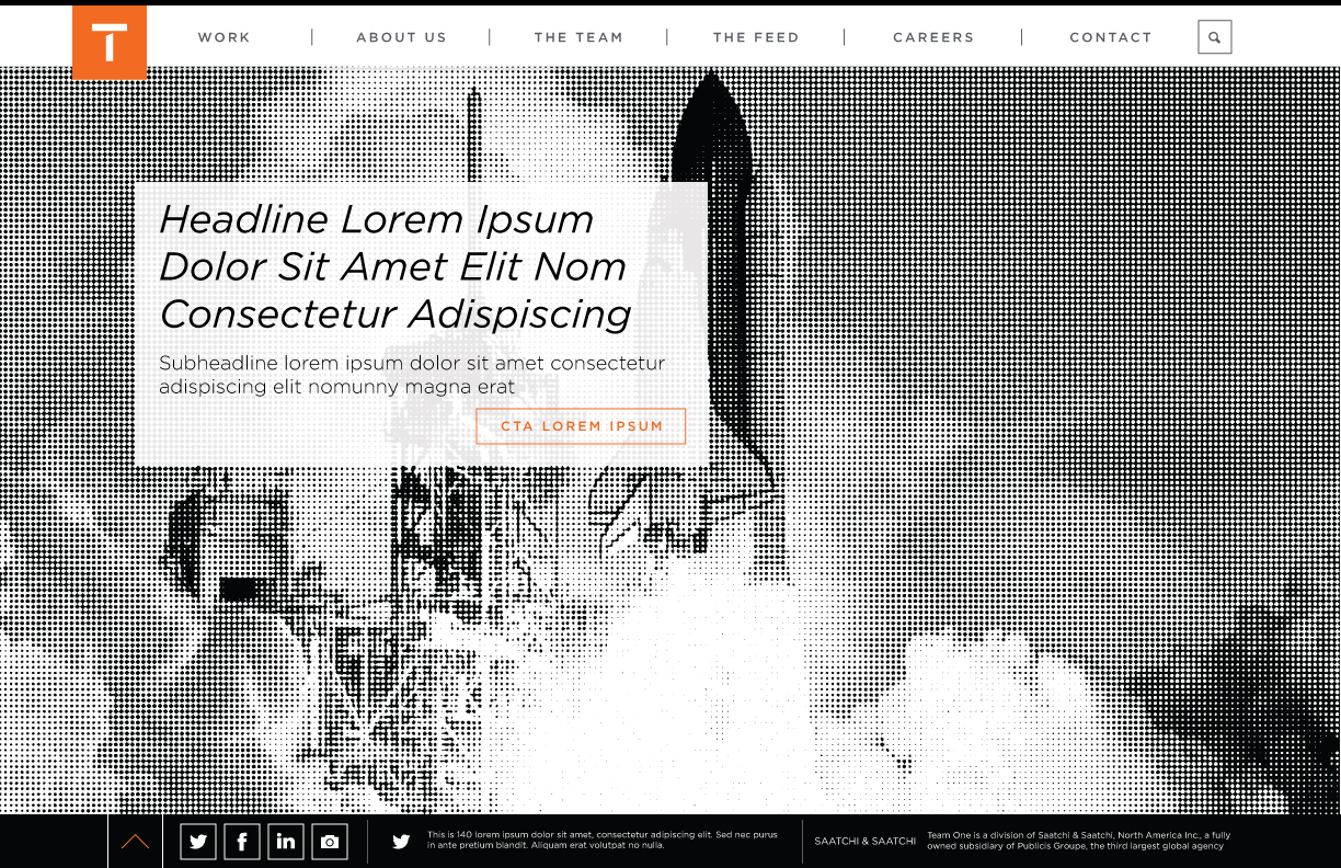
A simplistic Home page design allows for dynamic messaging upon landing quicklu funneling users into the deeper content sections of the website
Home - 1
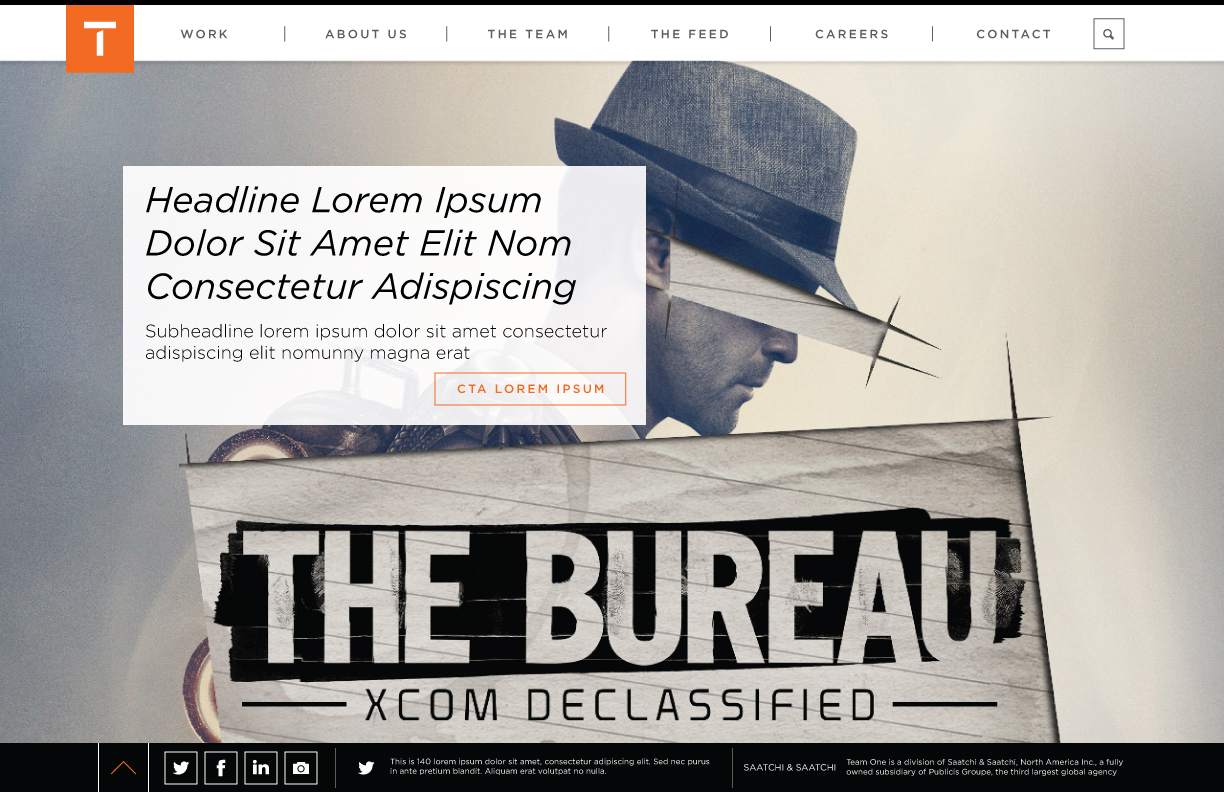
Home - 2
Work-In-Progress from the Team One website redesign
View Project on GitHub or View Our Kitchen Sink
When viewing this page: Please keep in mind that this is all WORK-IN-PROGRESS and all creative, design and development will continue to be refined and improved upon as we move forward towards launch
A simplistic Home page design allows for dynamic messaging upon landing quicklu funneling users into the deeper content sections of the website
Home - 1
Home - 2
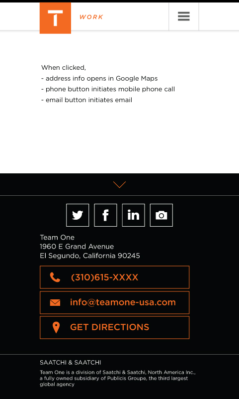
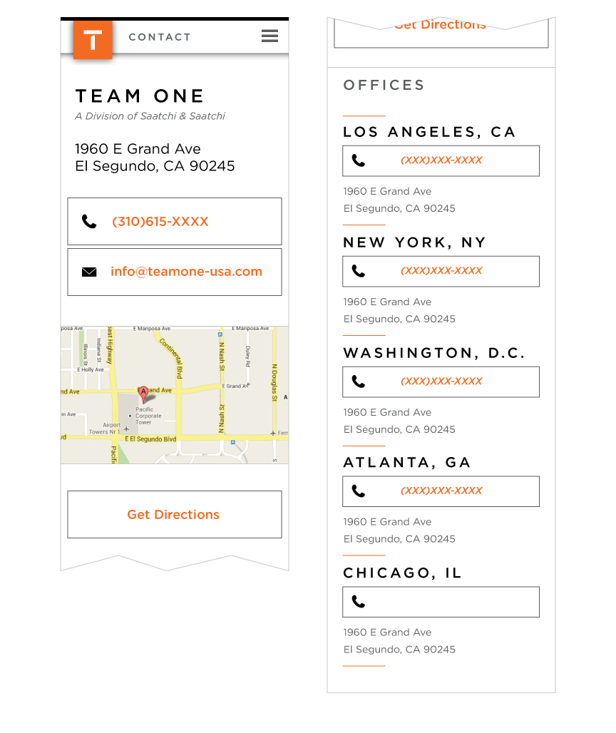
Added a 'Get Directions' button
Home - 1
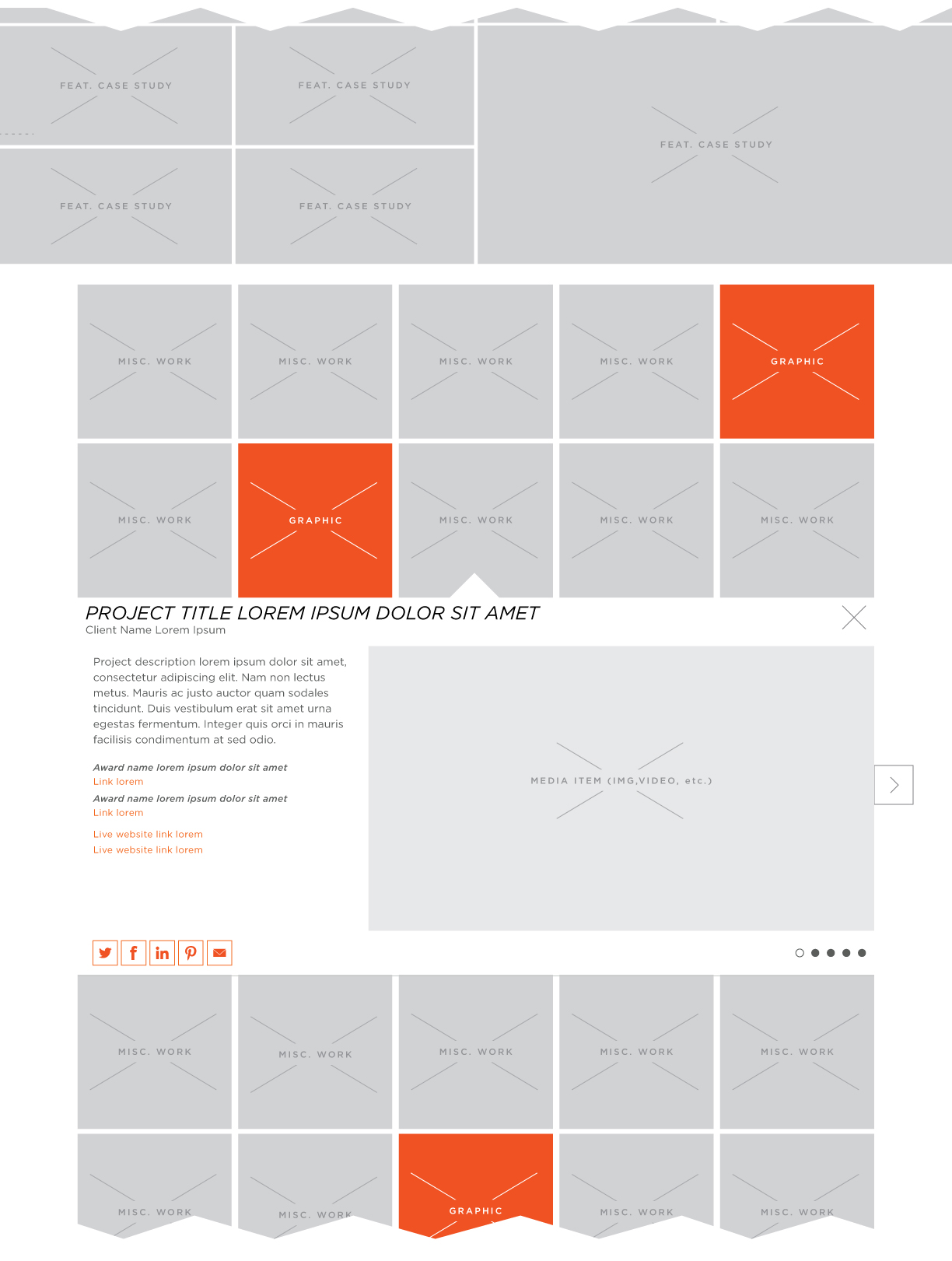
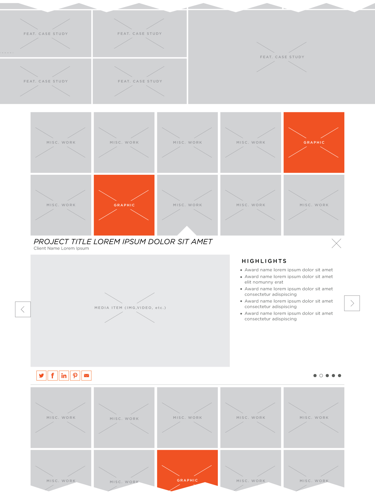
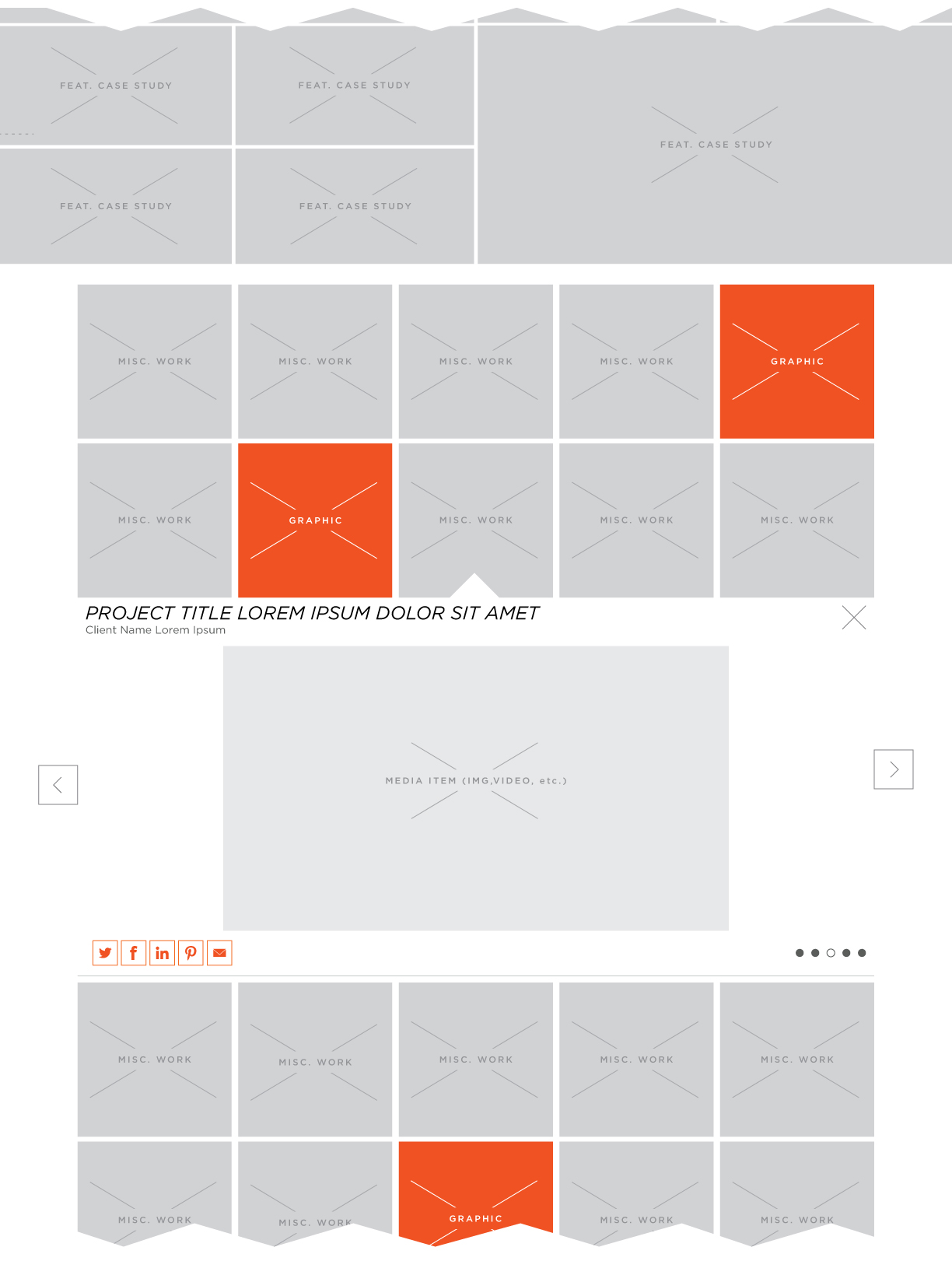
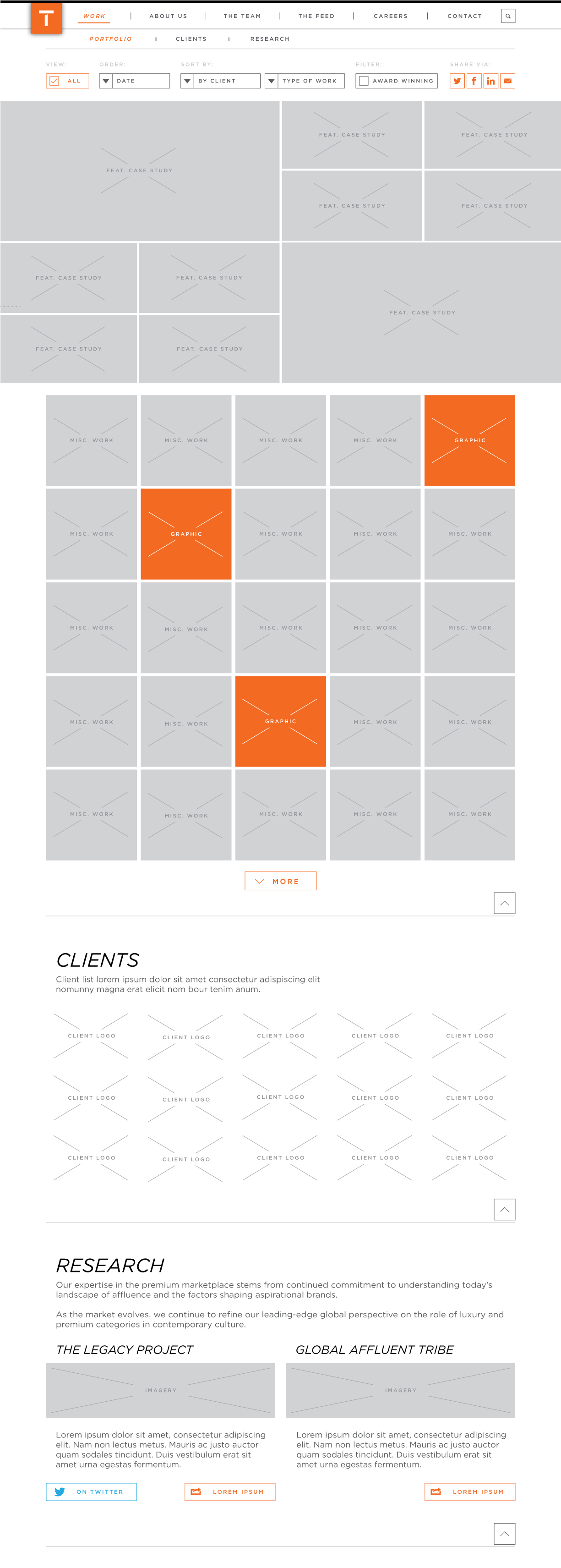
Details for secondary Work content display in desktop
Work - Grid Open - Default
Work - Grid Open - 2
Work - Grid Open - 3
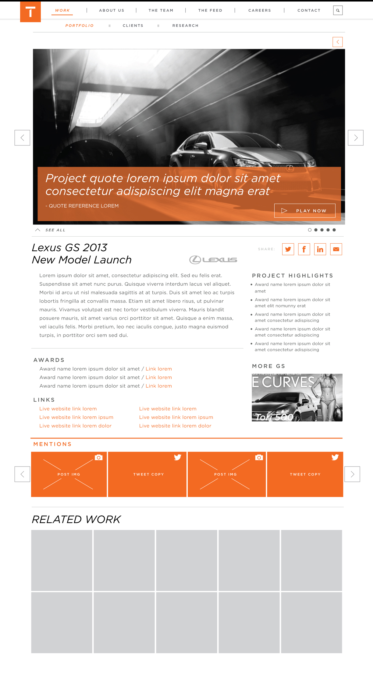
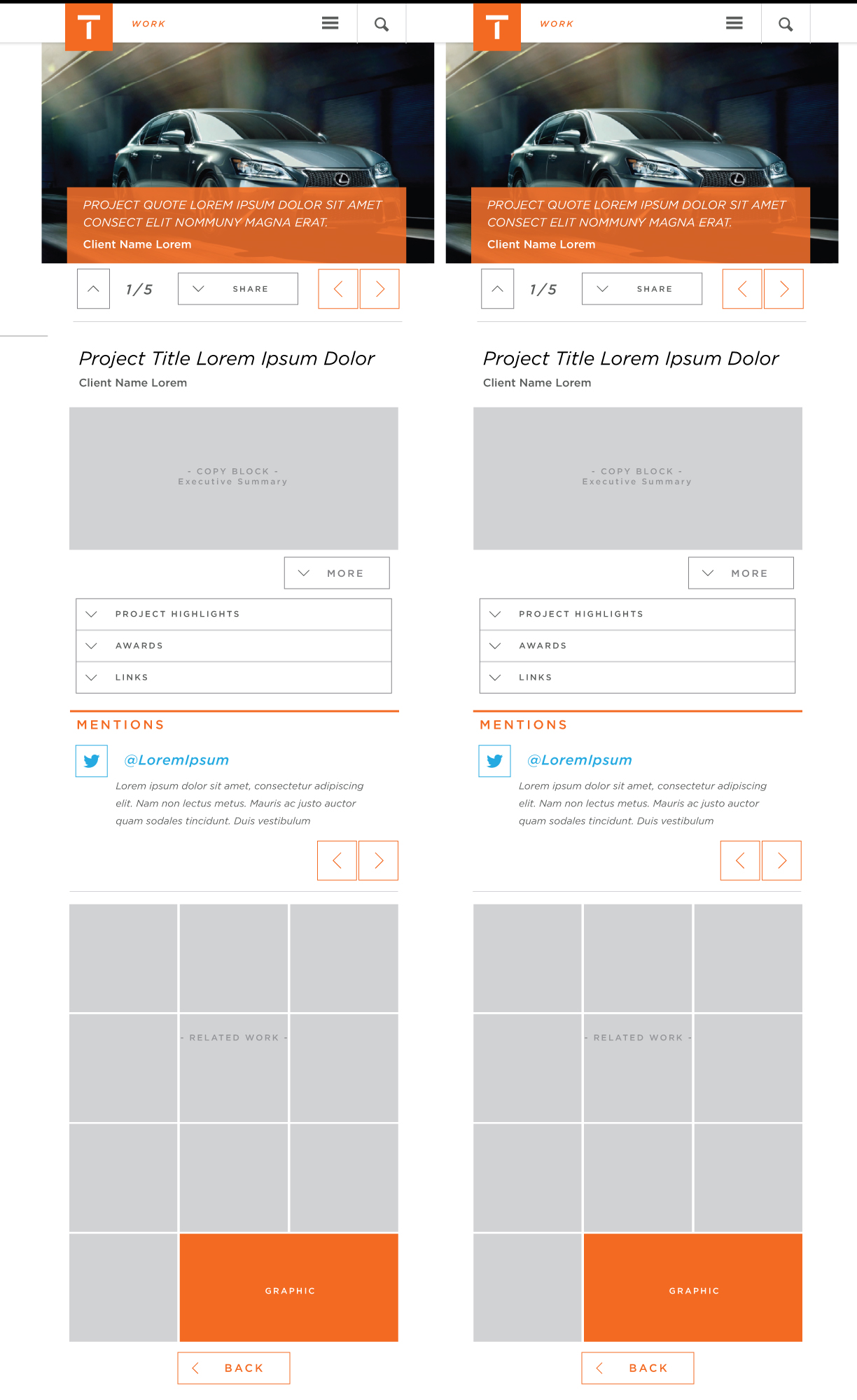
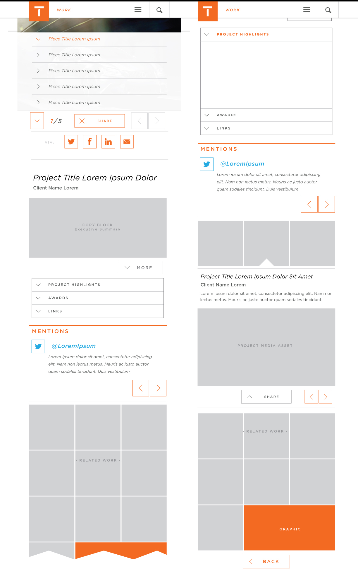
Updated design of desktop state for the Featured Case Study details page
Desktop Default
Desktop Annotations

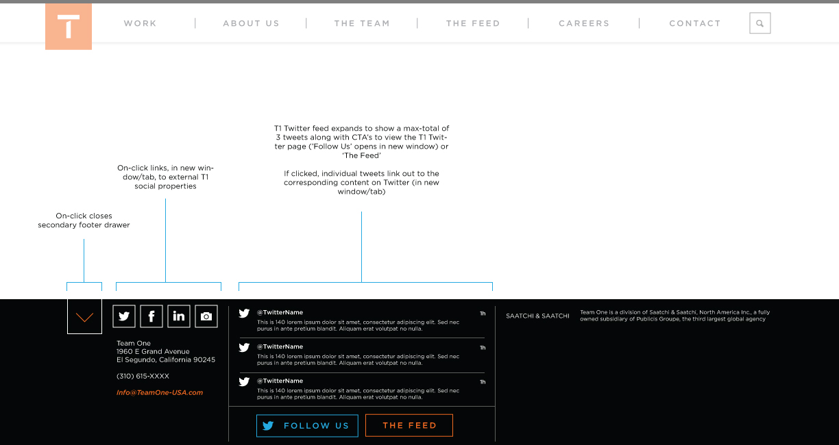
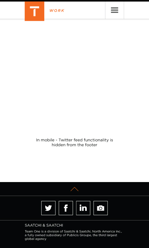
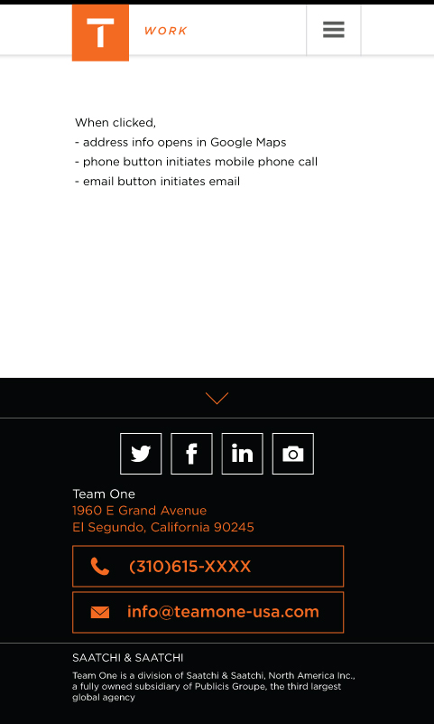
Design of global footer elements for desktop and mobile states
Desktop Default - Closed
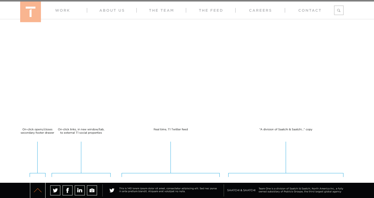
Desktop - Expanded
Mobile Default - Closed
Mobile - Expanded
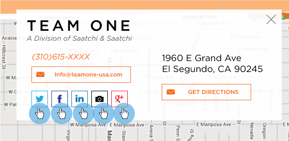
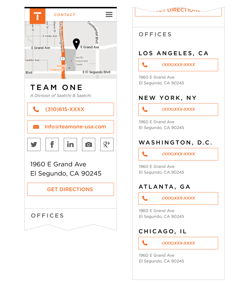
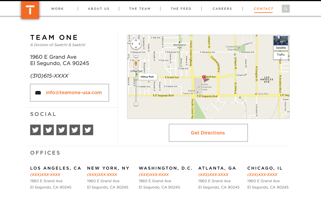
Layout for the new Contact page has been adjusted to align with 'hero image' visual approach placing the visually customized Google map full-width, at top, with contact info card overlayed on it. Mobile layout has been adjusted to reflect the revised content hierarchy and layout requirements.
Desktop Contact Page
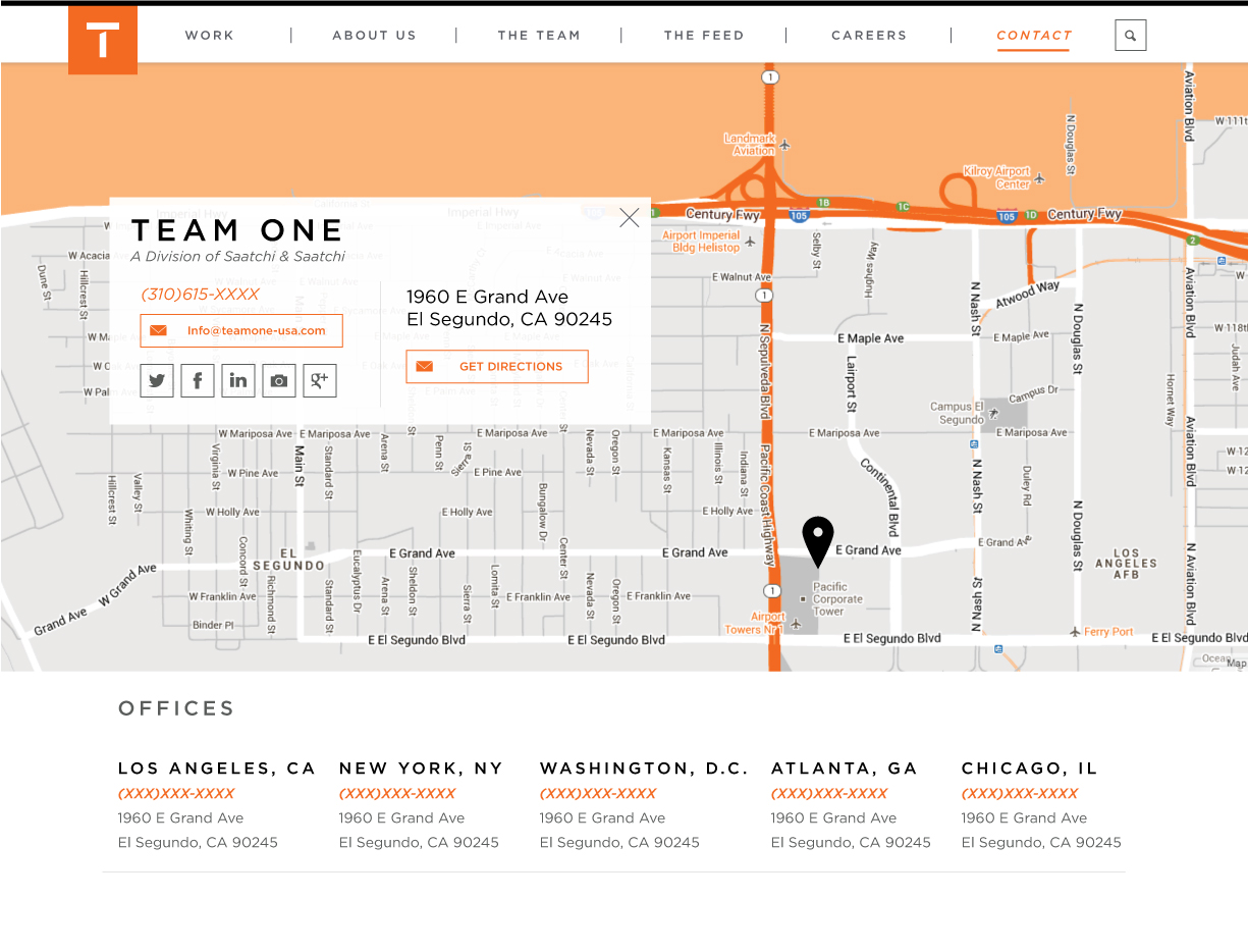
Desktop Contact Page - HOVER
Mobile Contact Page
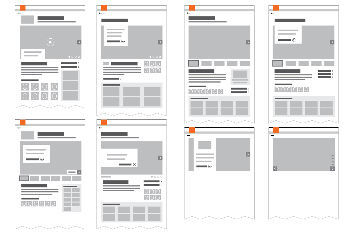
When a guest selects any one of the 'Top 10' Featured Case Studies within the Work > Portfolio section, they will be directed to the corresponding project details page - below are the mobile layouts for that Project Detail page. Layouts will adjust based upon content (max-content layout shown here).
Basic Mobile Default
Mobile - Expanded States
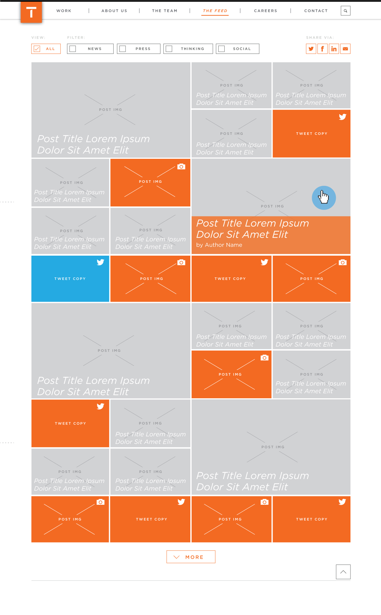
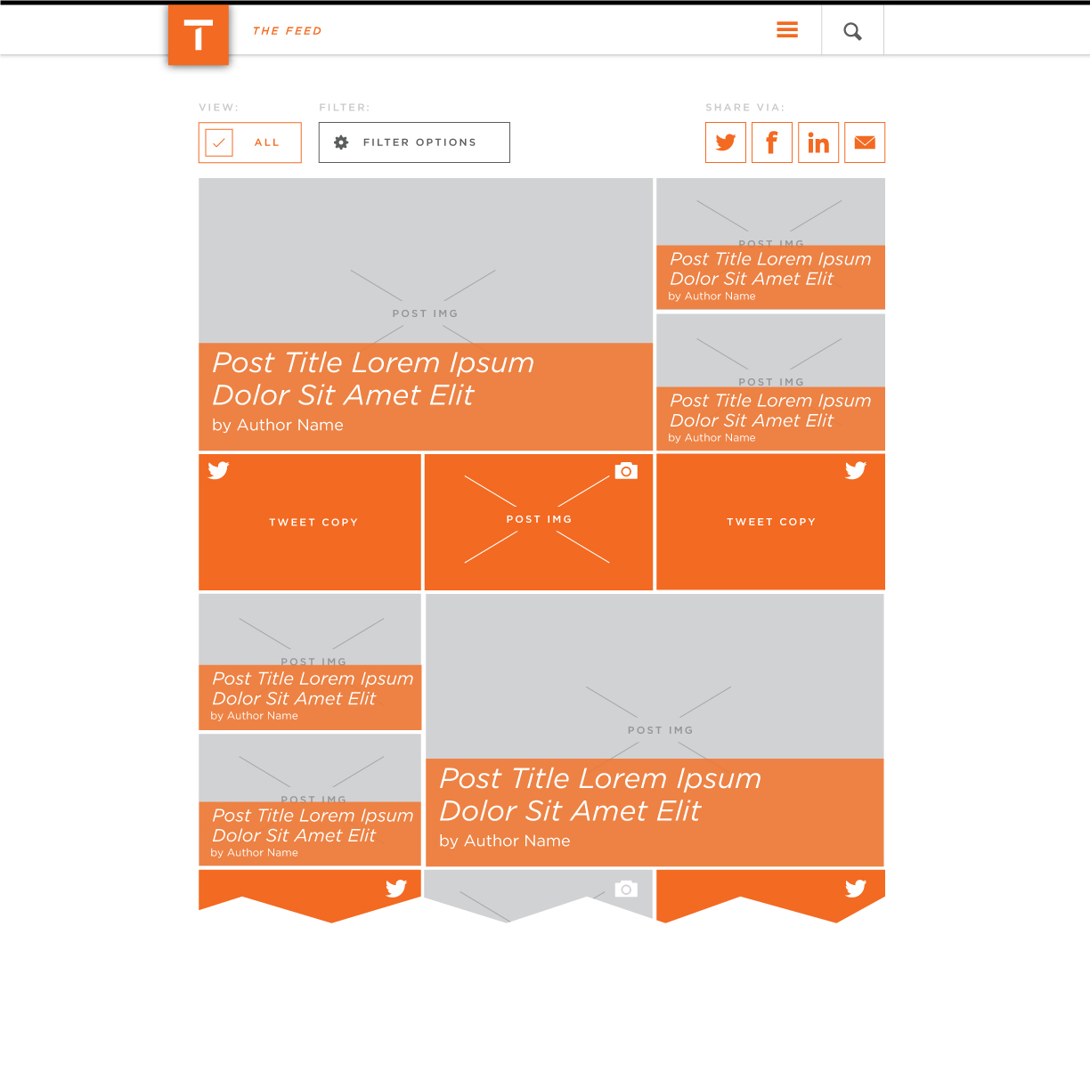
Leveraging the grid layout, The Feed section will showcase a combination of T1-published News, Press and Thought Leadership pieces in addition to a mixture of Instagram and Twitter social content
Basic Default Layout
Tablet Layout
Mobile Layouts
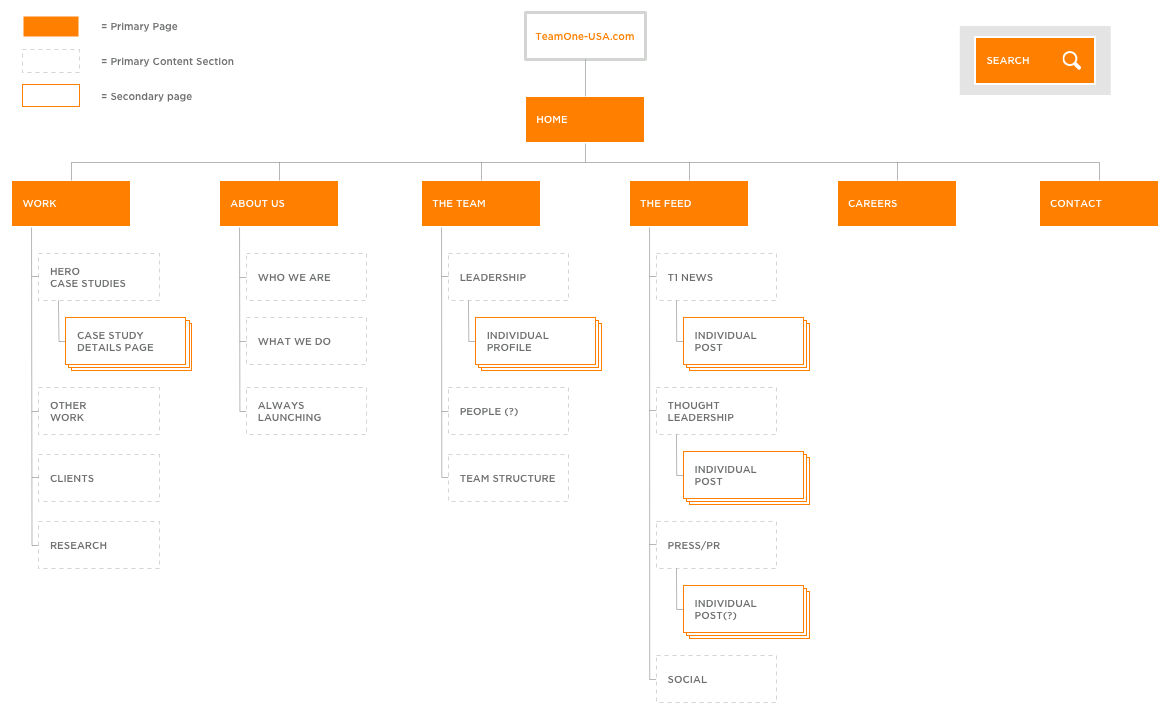
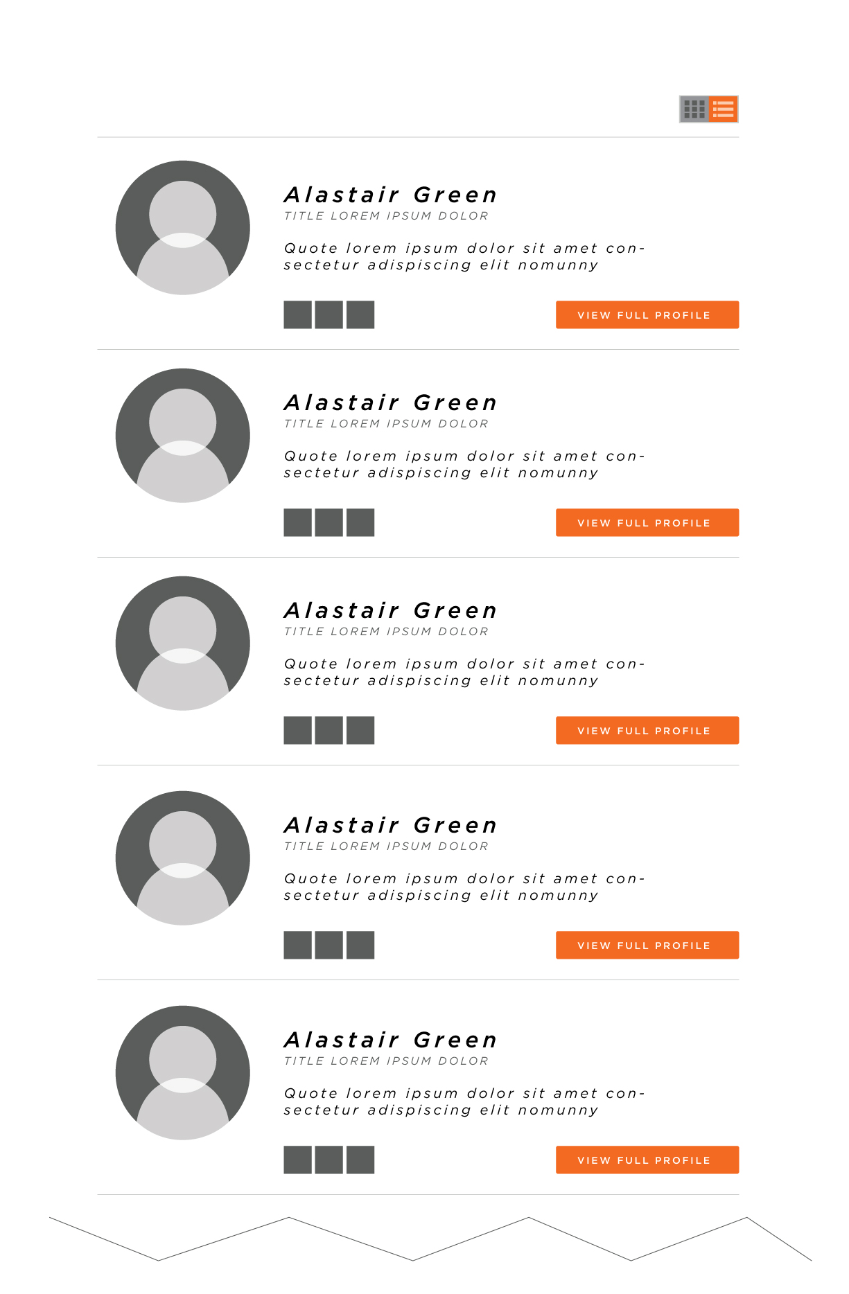
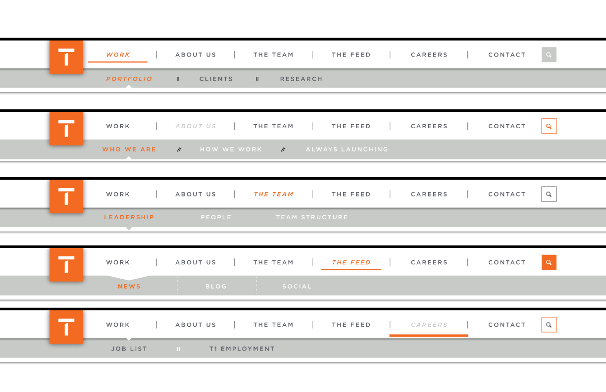
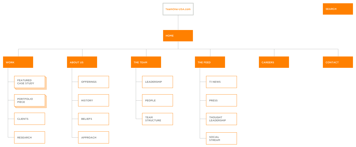
The team has determined that a long scroll page layout is more suitable for the design of the new Team One site so the Site Map document has been revised to reflect this sectioning of primary content rather than the creation of individual pages. This will allow for a more seamless experience, juxtaposing relevant supporting content with primary showcase elements.
The Team Default
The team has determined that a long scroll page layout is more suitable for the design of the new Team One site so the Site Map document has been revised to reflect this sectioning of primary content rather than the creation of individual pages. This will allow for a more seamless experience, juxtaposing relevant supporting content with primary showcase elements.
Updated Site Map
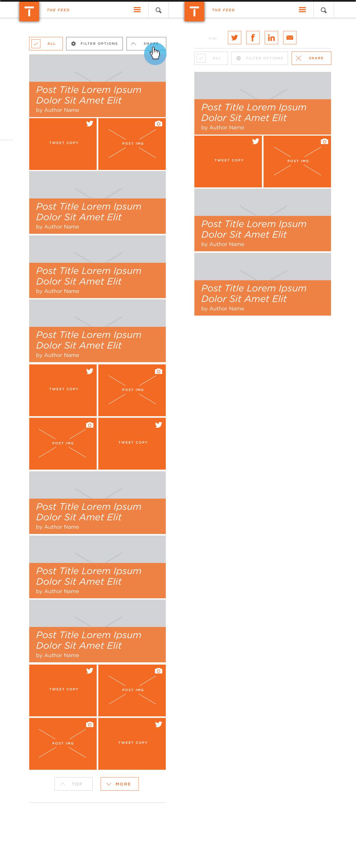
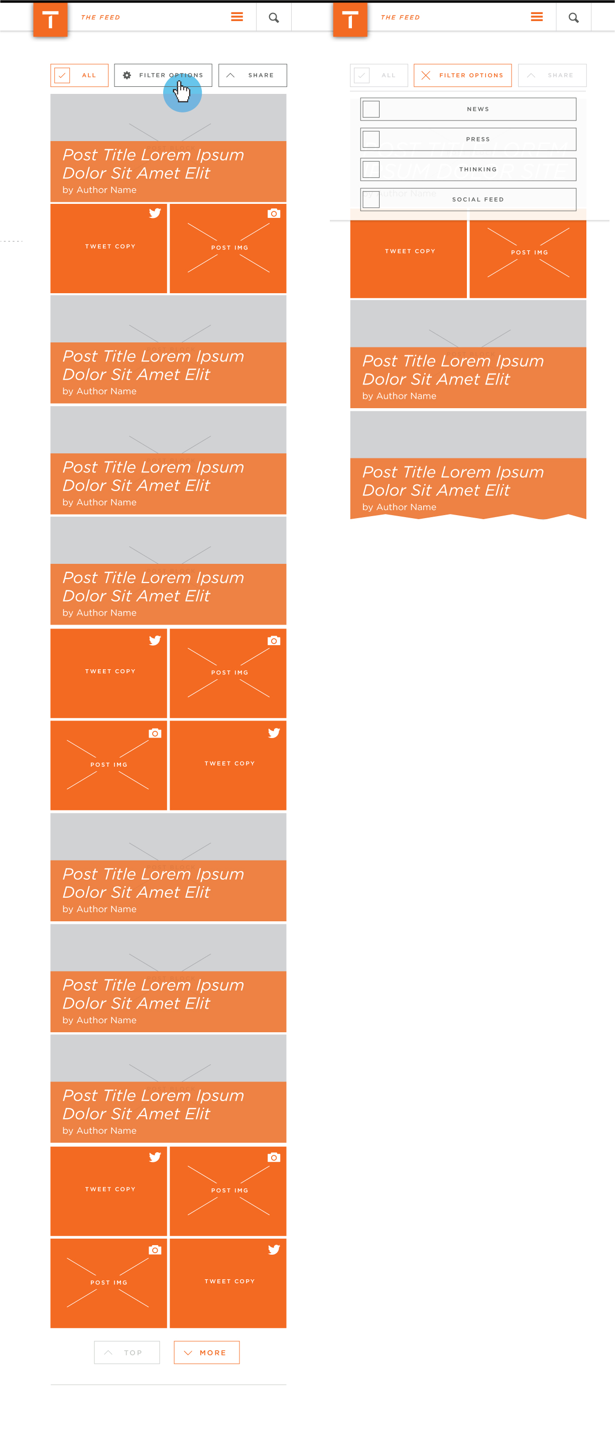
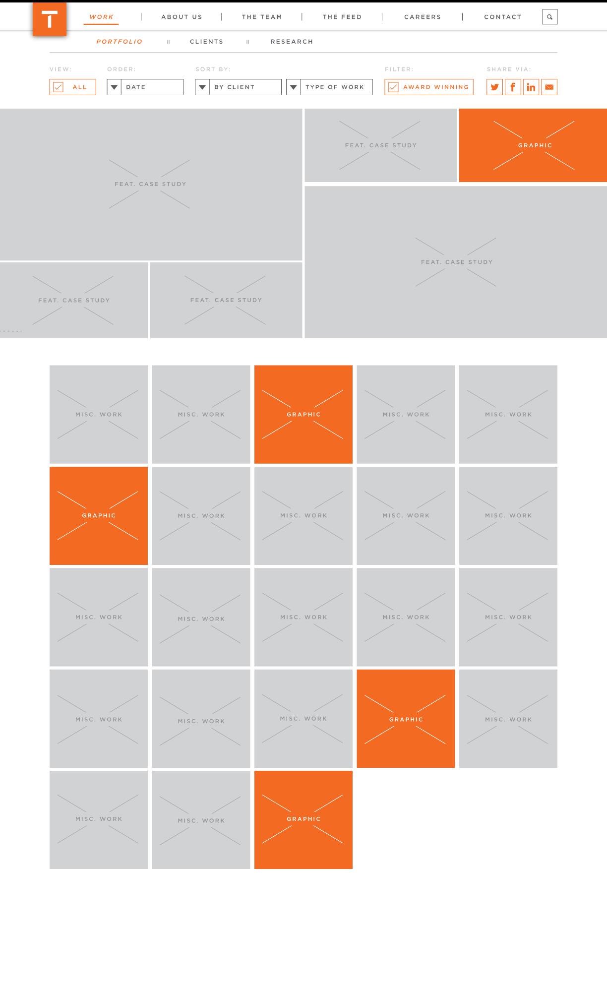
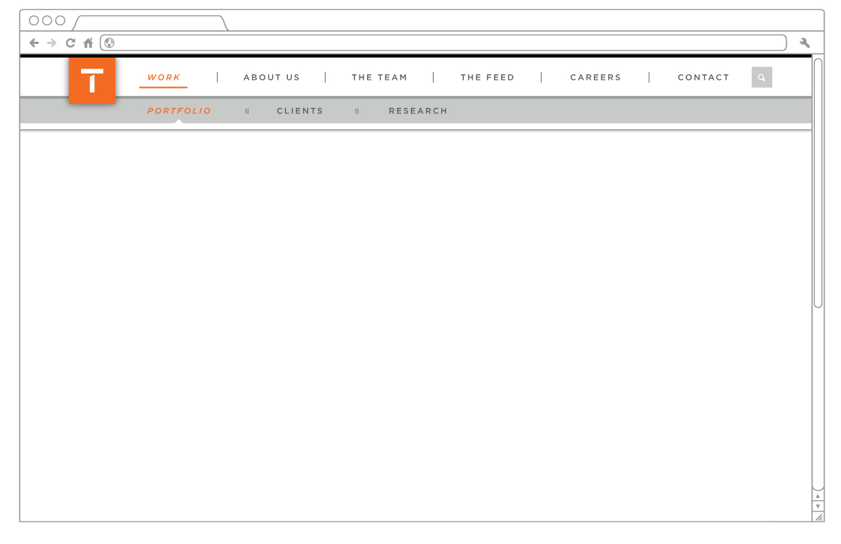
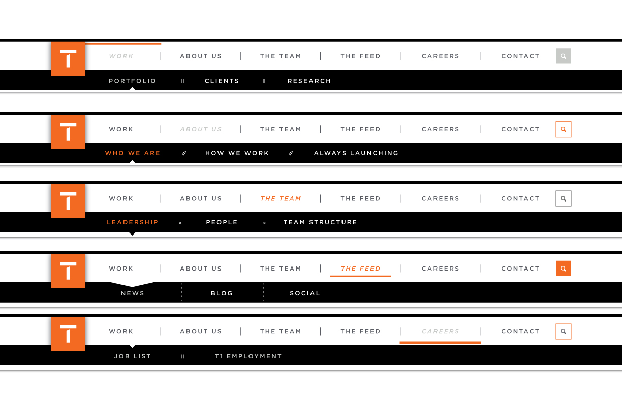
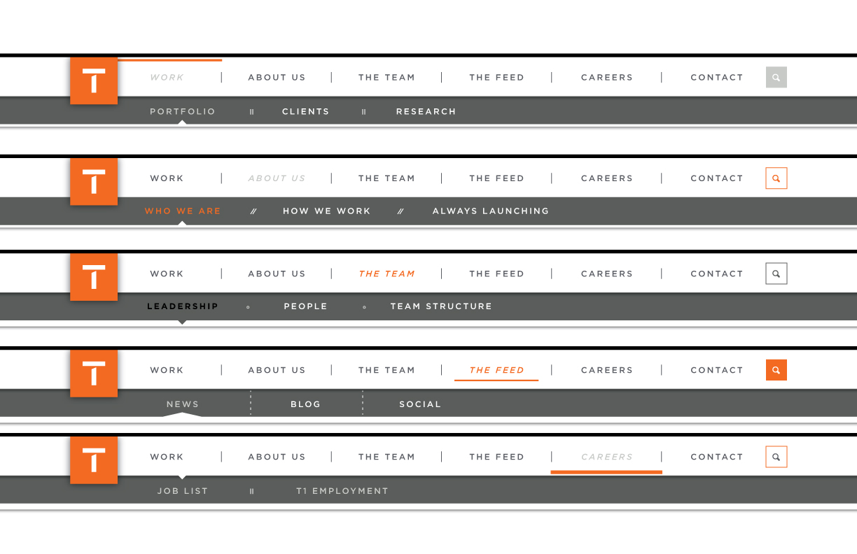
In-depth detailing of sort/filter functionality to be implemented in the Work, The Team & Feed website sections
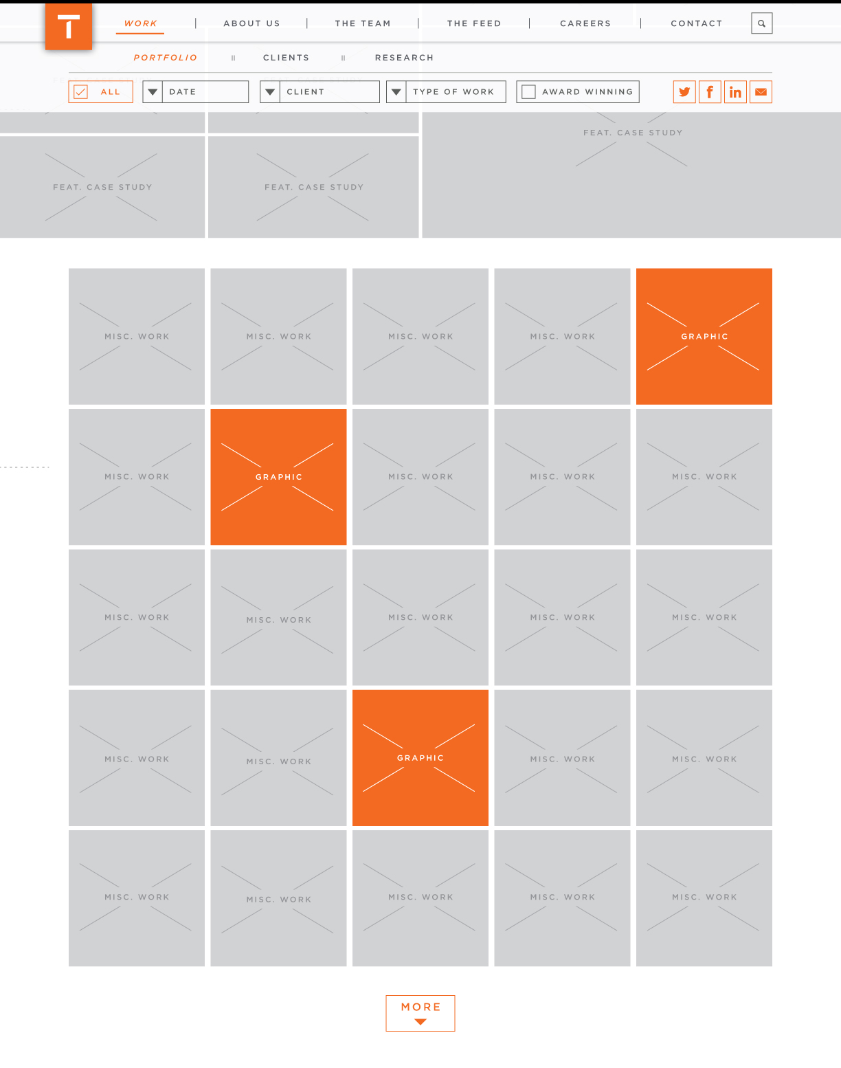
Work Section Landing Page - DEFAULT:
Work Section Landing Page - ON SCROLL:
Sort/filter option headers disappear and controls are fixed top
Work Section Landing Page - DROPDOWNS OPEN:
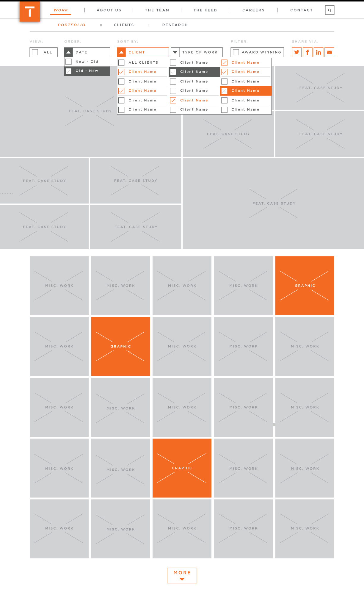
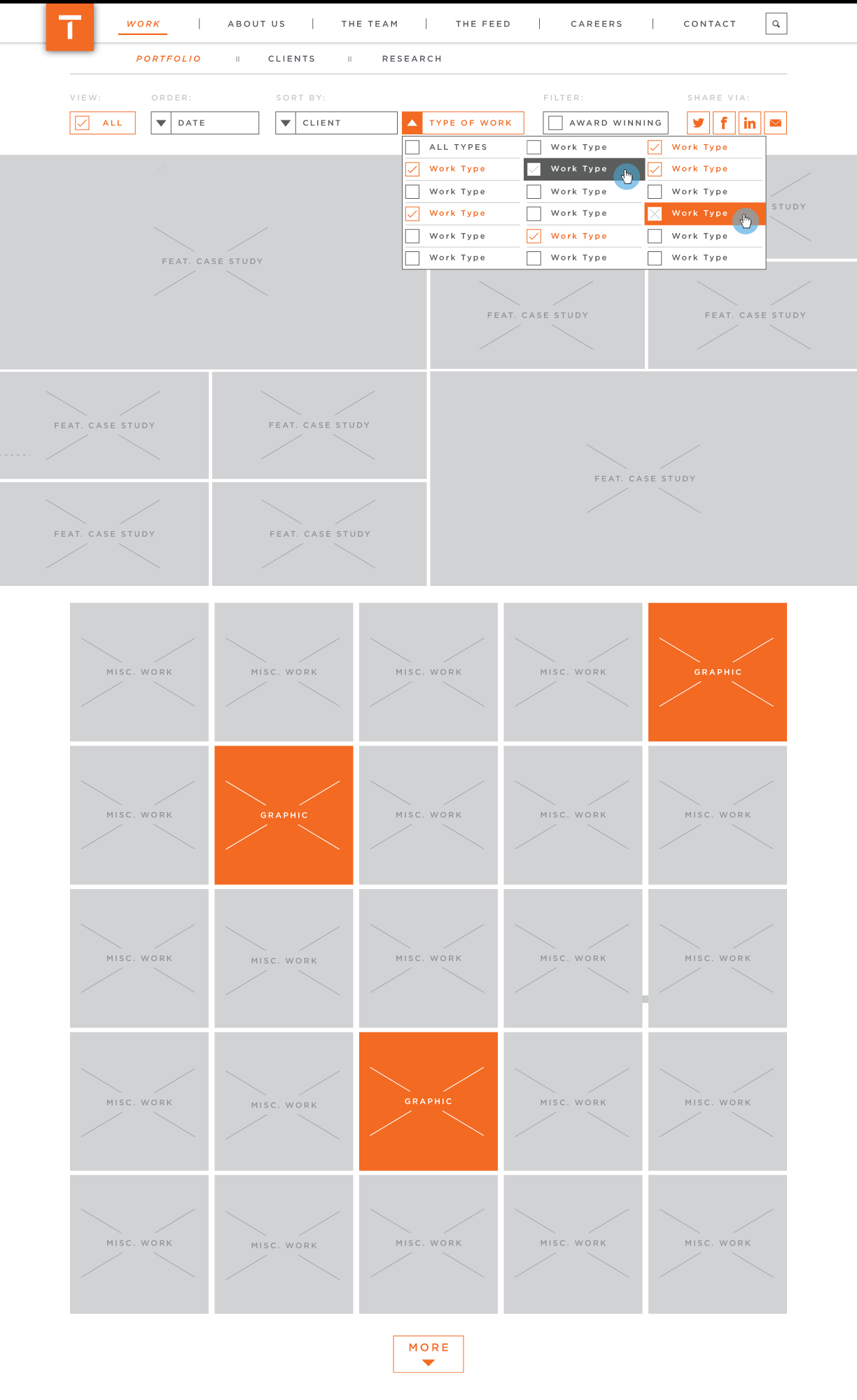
Work Section Landing Page - FILTERED:
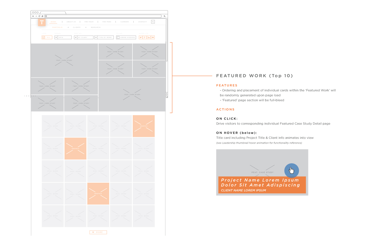
ANNOTATIONS: Featured Work Content
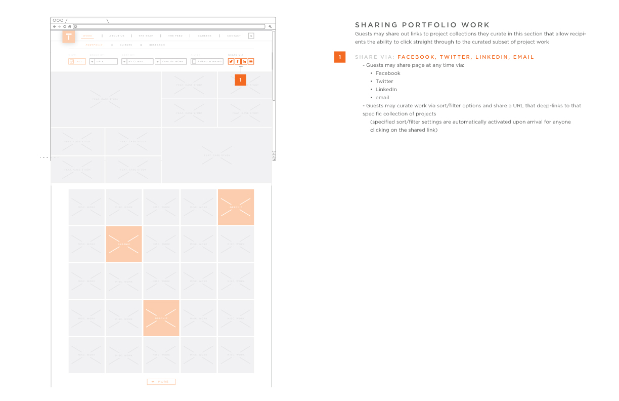
ANNOTATIONS: Sharing Curated Portfolio Content
In-depth detailing of sort/filter functionality to be implemented in the Work, The Team & Feed website sections
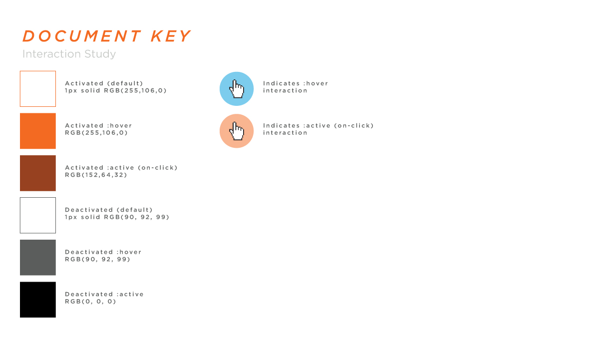
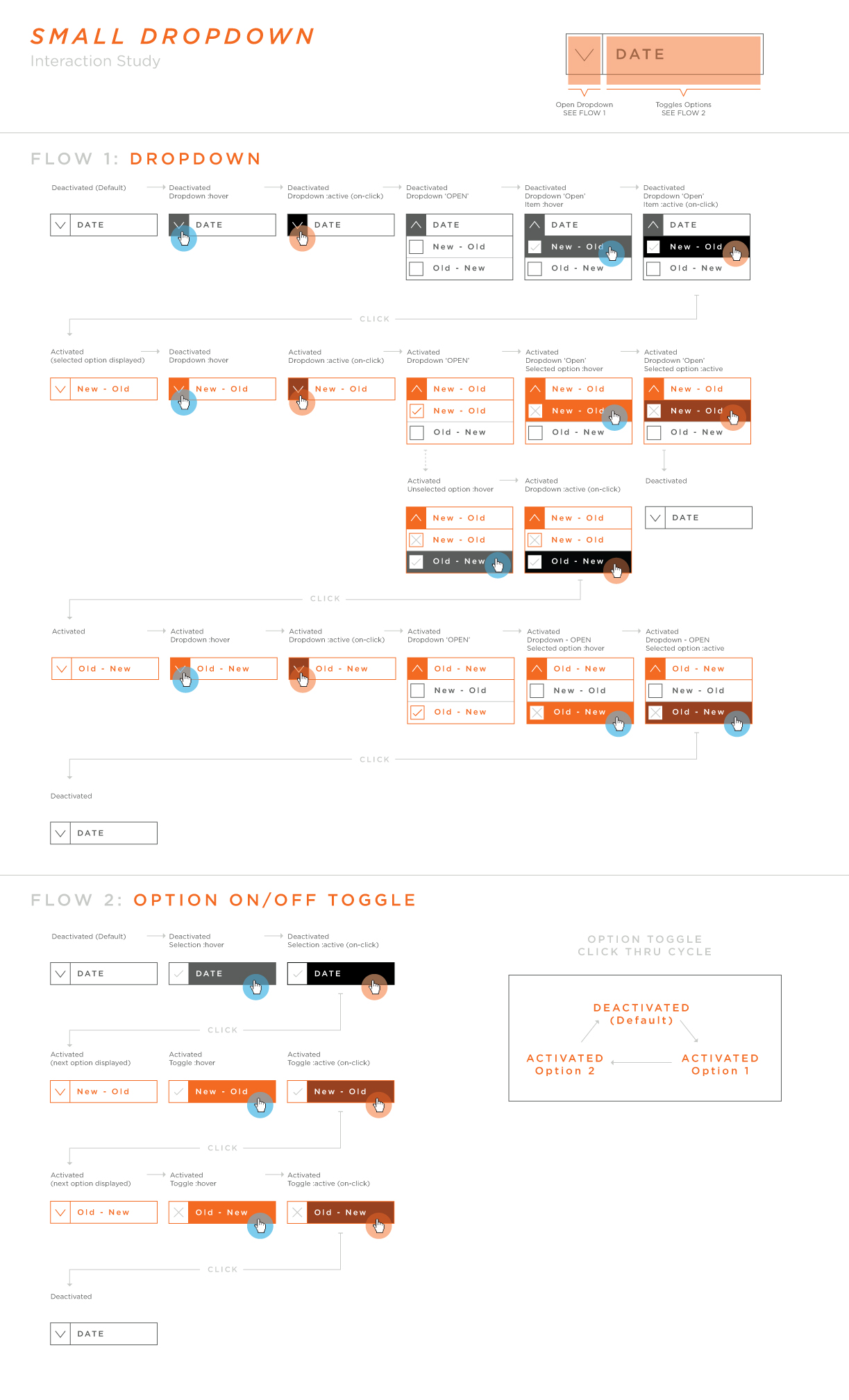
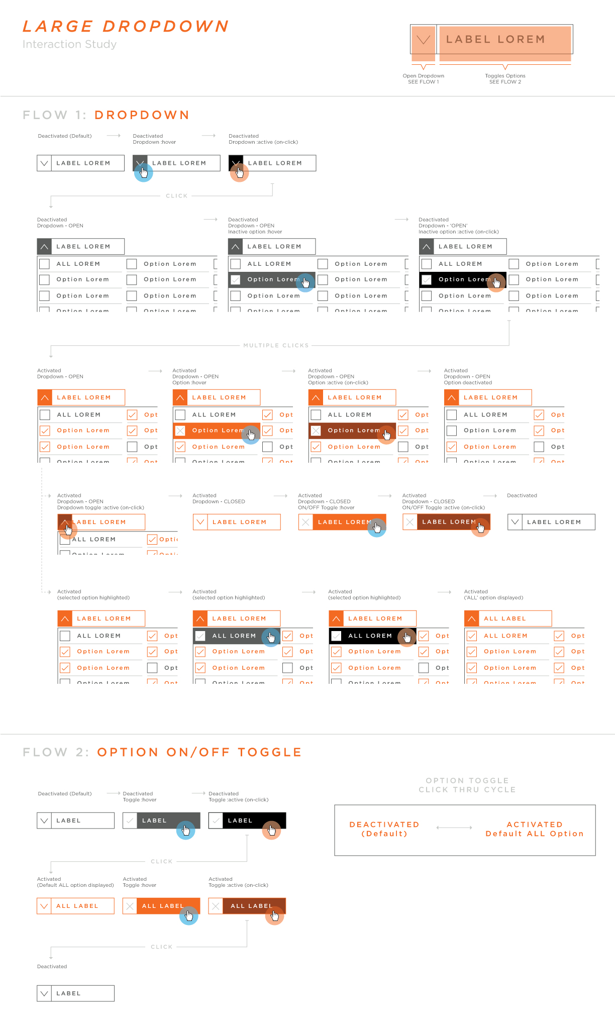
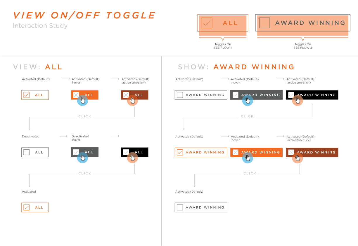
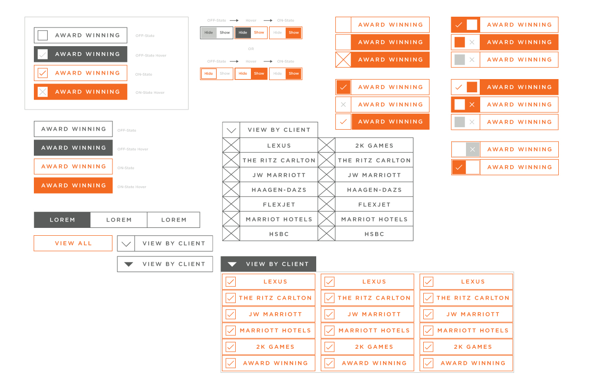
Initial exploration of button, toggle and dropdown menu styling aimed toward solving the needs of Work and The Team sections
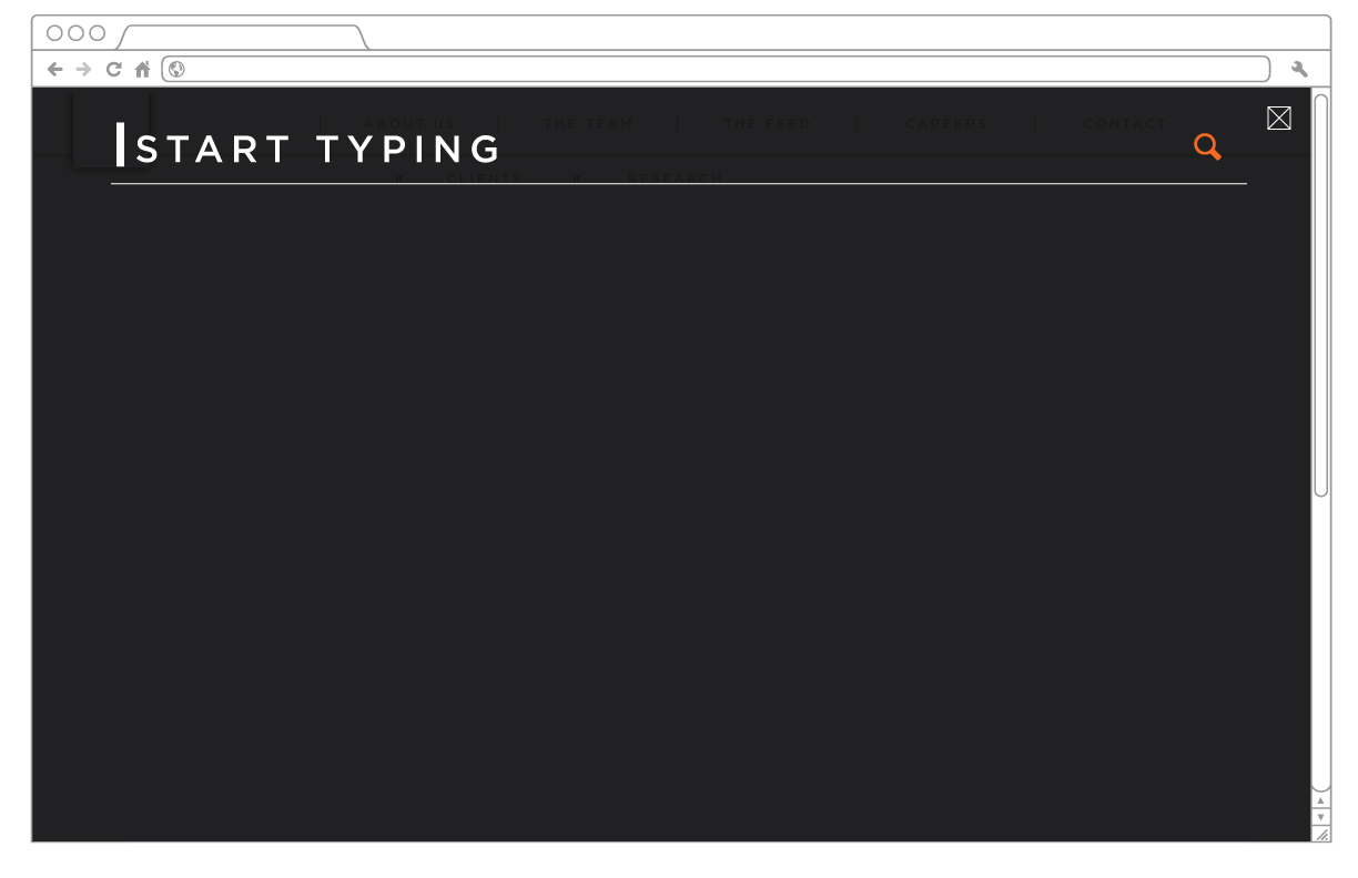
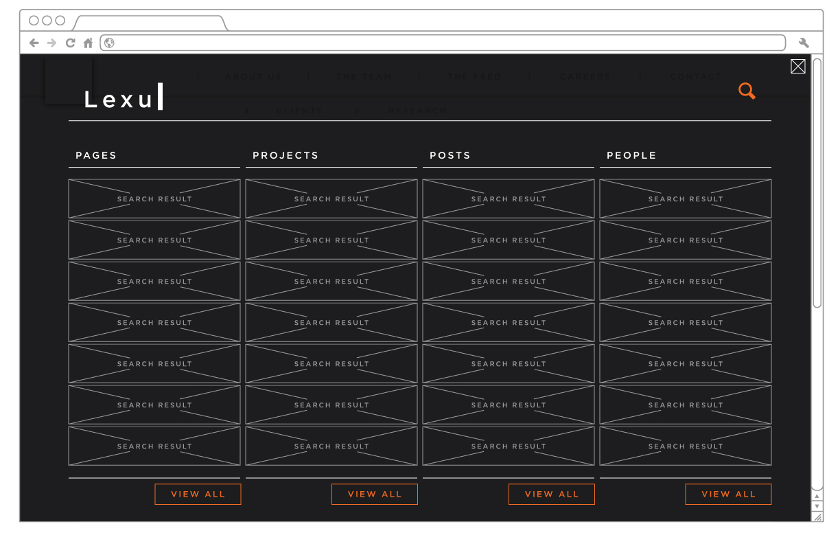
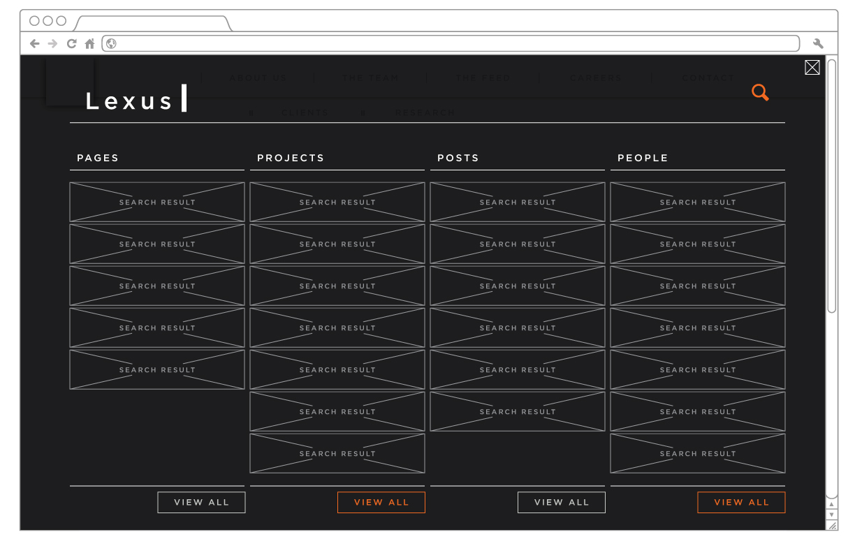
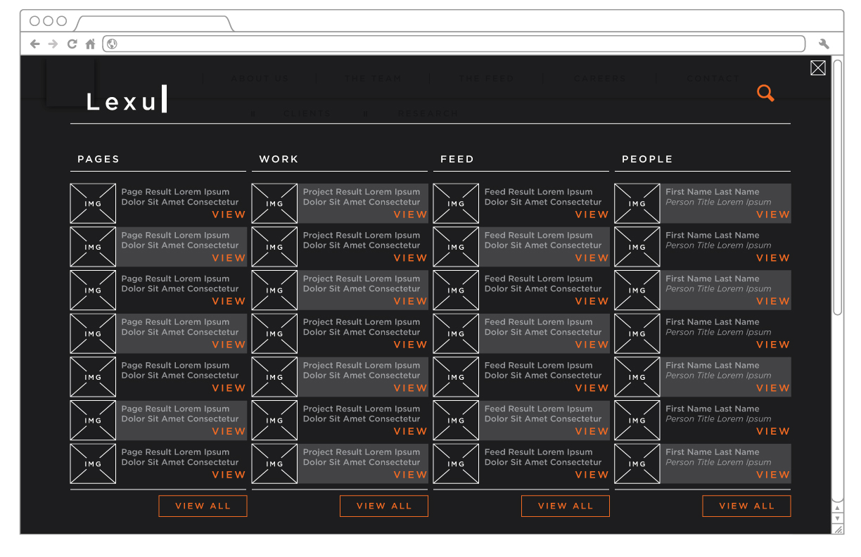
When a user selects the search button they will activate a full-screen search interaction pattern:
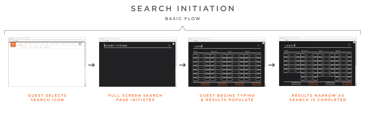
Animatic of the basic interaction functionality concept:
Layouts
After consulting with the creative team, these will be the new button styles:
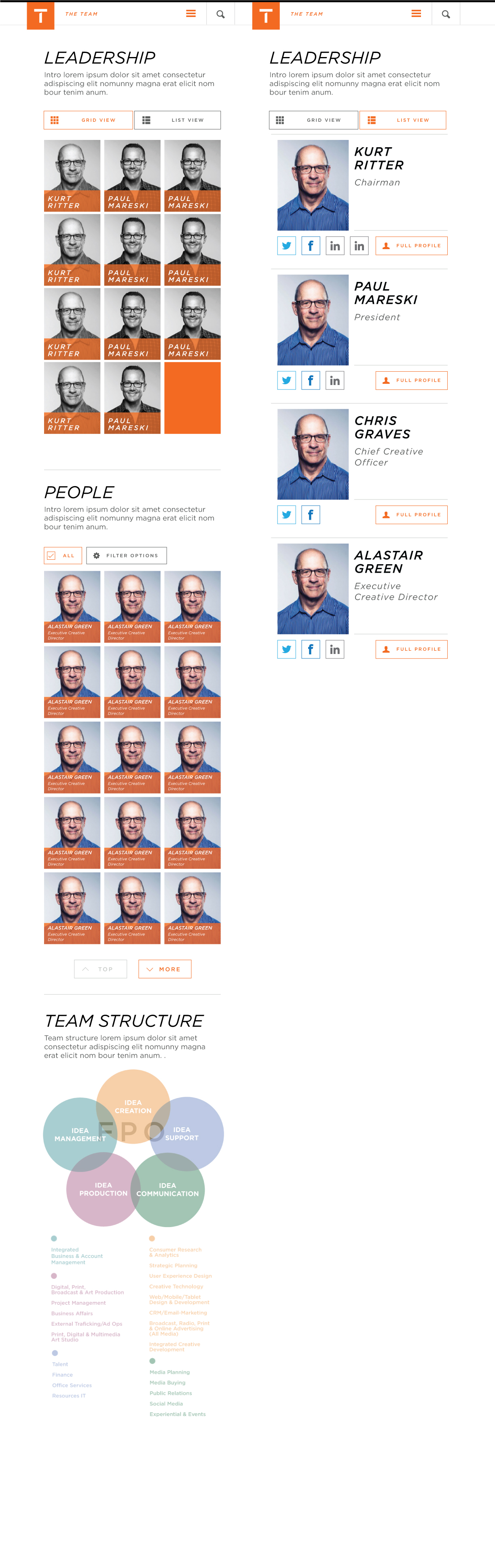
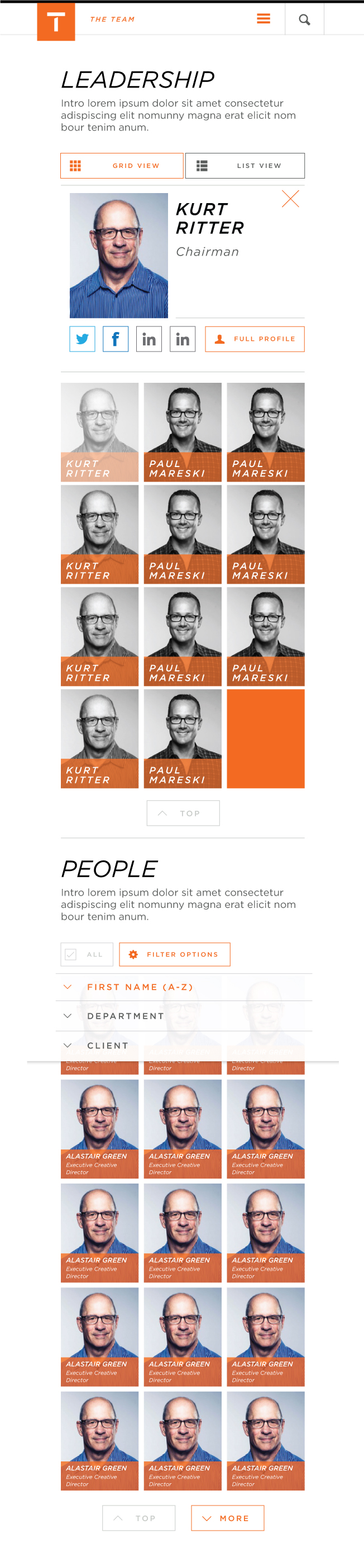
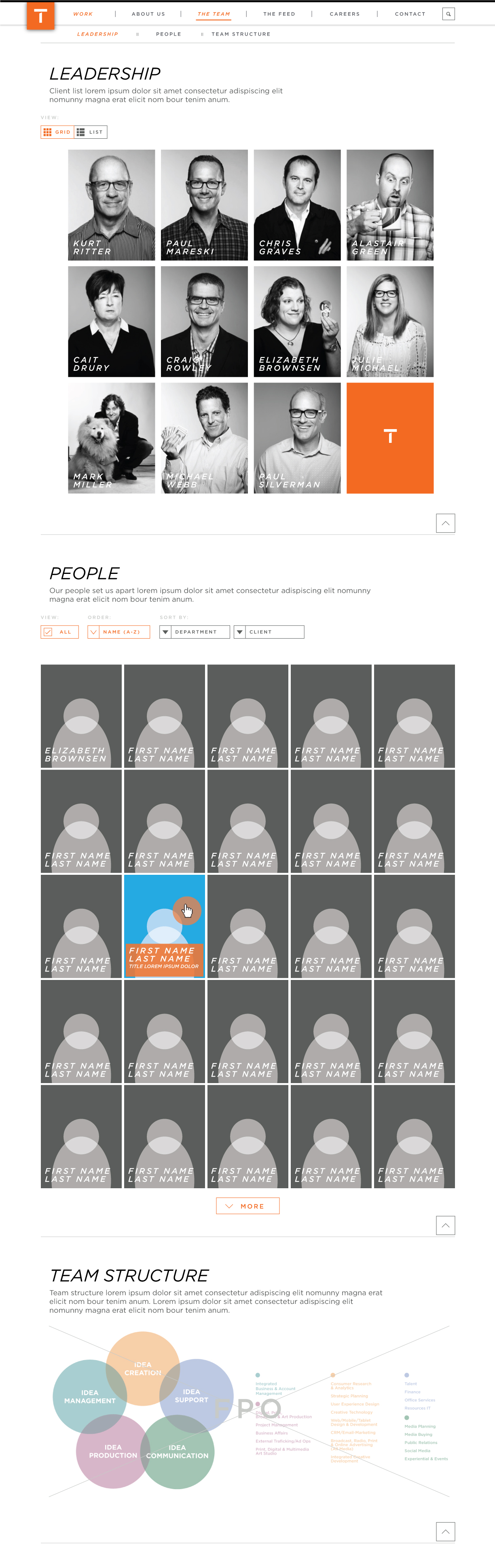
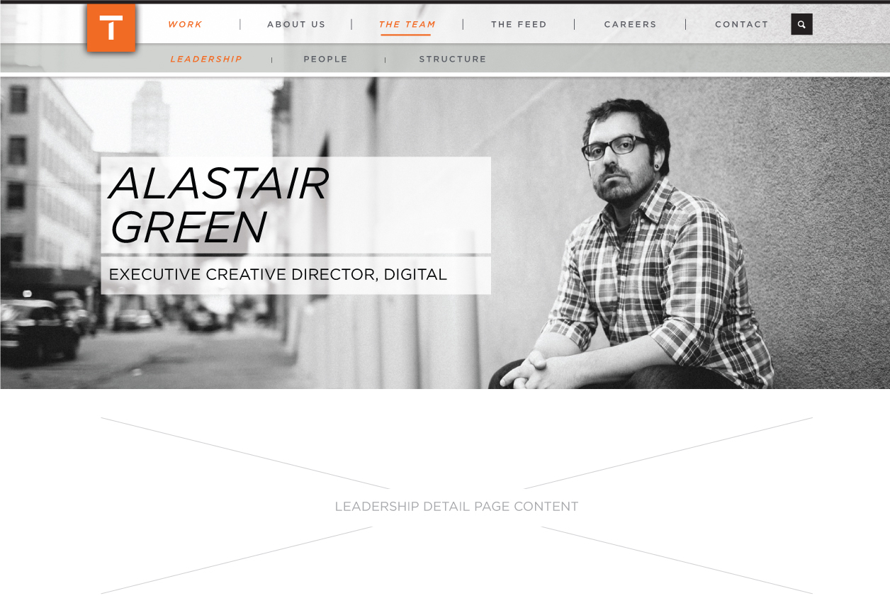
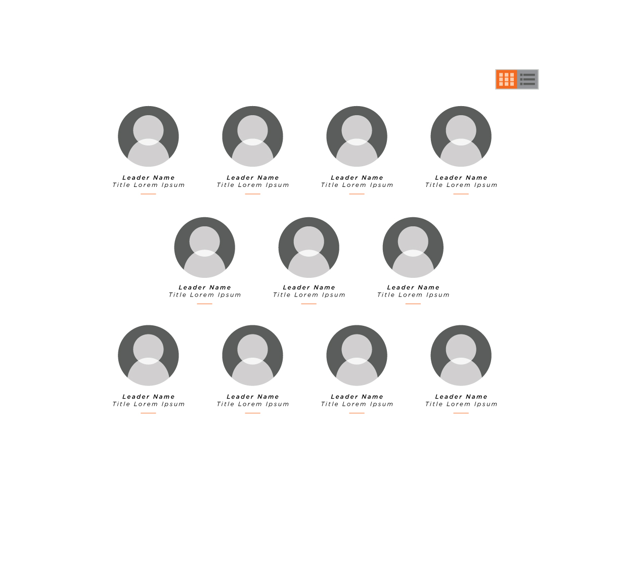
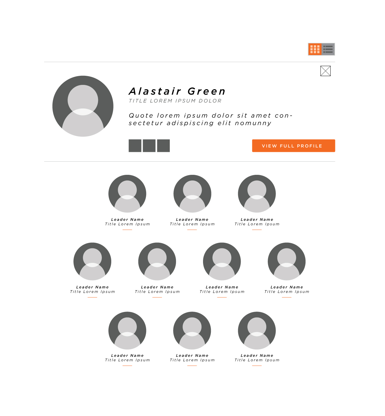
LAYOUT: When a Leadership thumbnail image is hovered over, the displayed text will animate, moving upward to reveal the individual's title - this functionality is similar to that found in
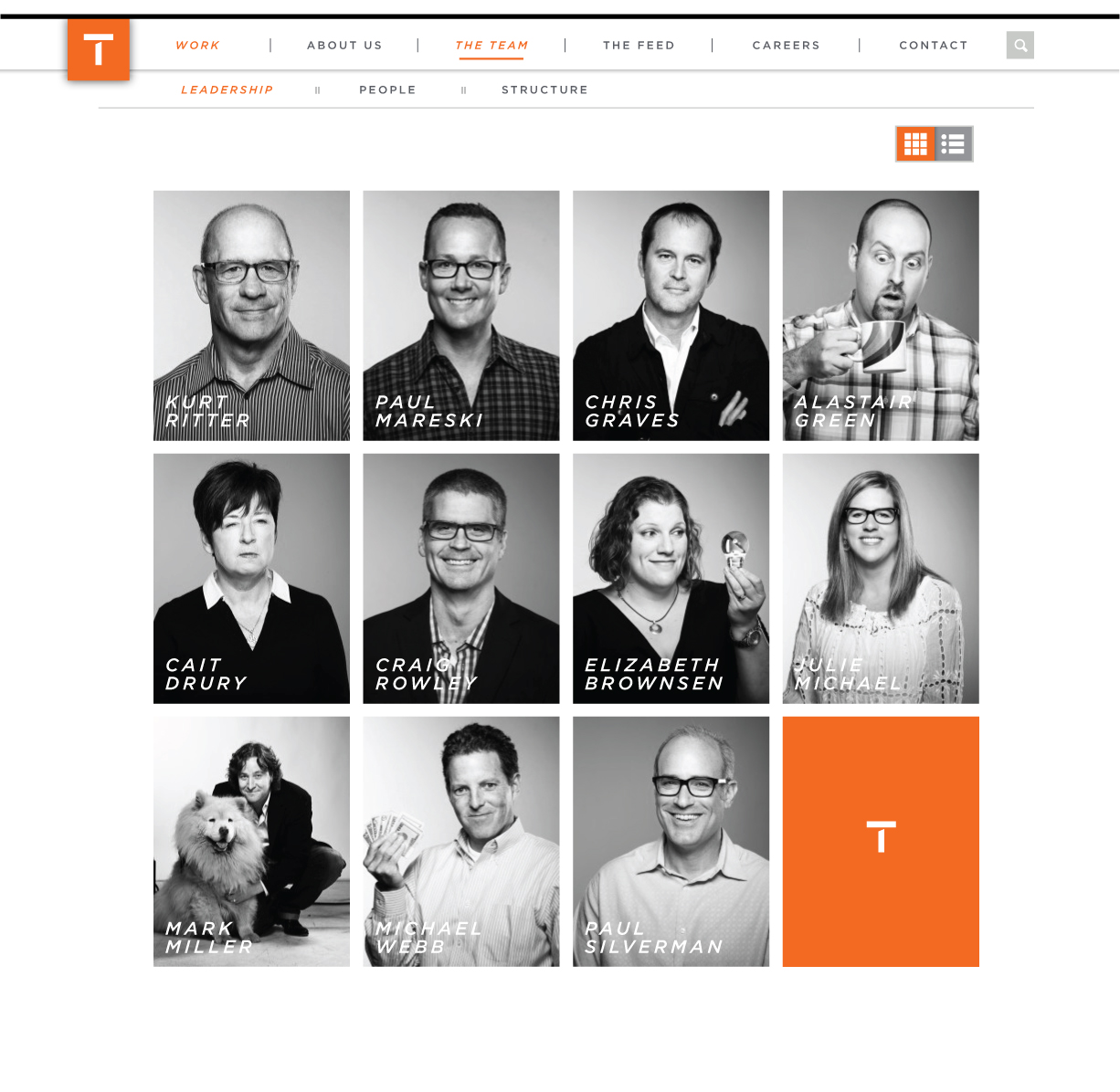
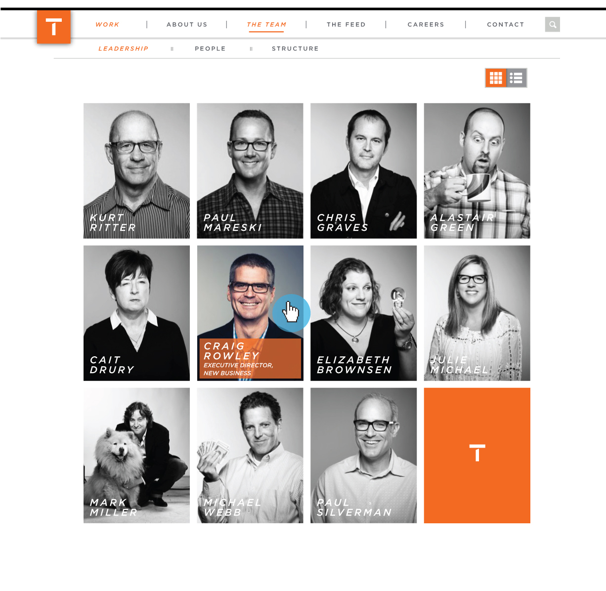
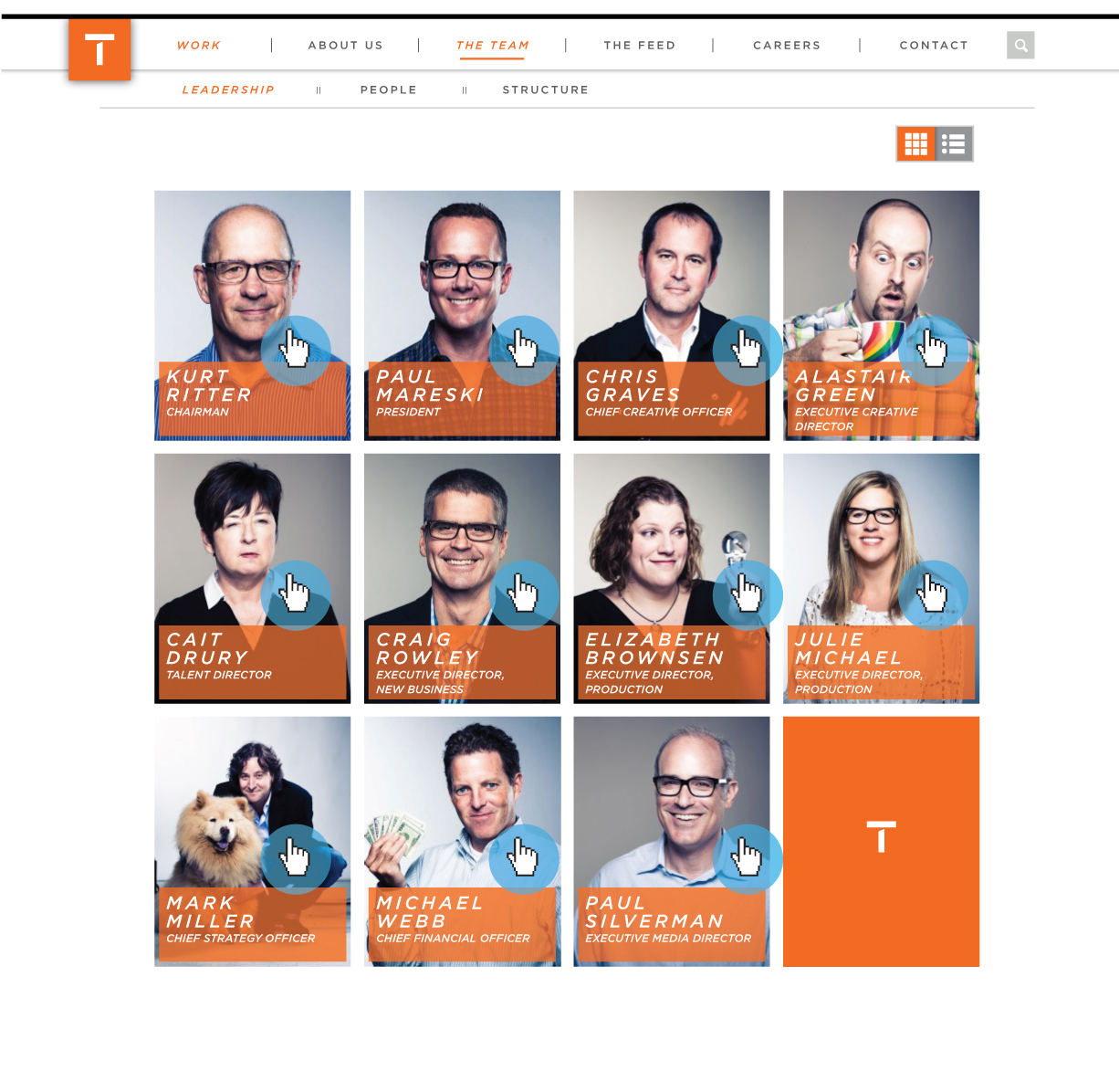
FUNCTIONALITY: When a Leadership thumbnail image is hovered over, the displayed text will animate, moving upward to reveal the individual's title - this functionality is similar to that found in the new Myspace interface
Animation prototype:
As seen on the new Myspace:
An exploration of CSS styling for primary buttons
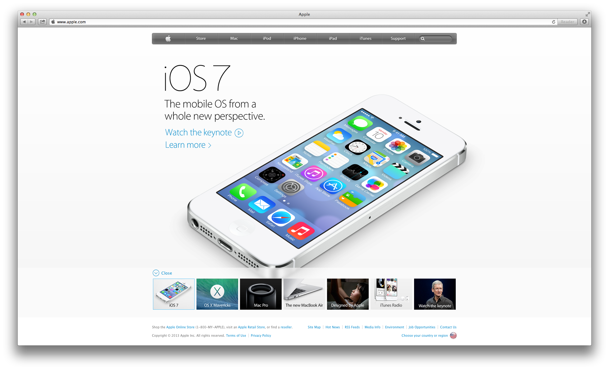
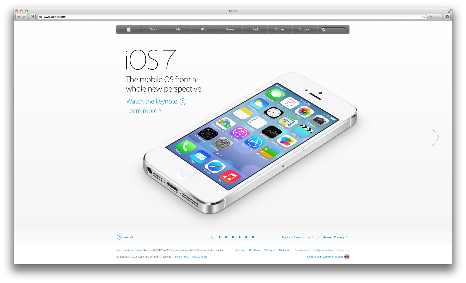
For the hero carousel unit on the new 'Featured Case Study' Work section page, we plan to leverage a similar carousel interaction pattern as that found on the new Apple.com landing page
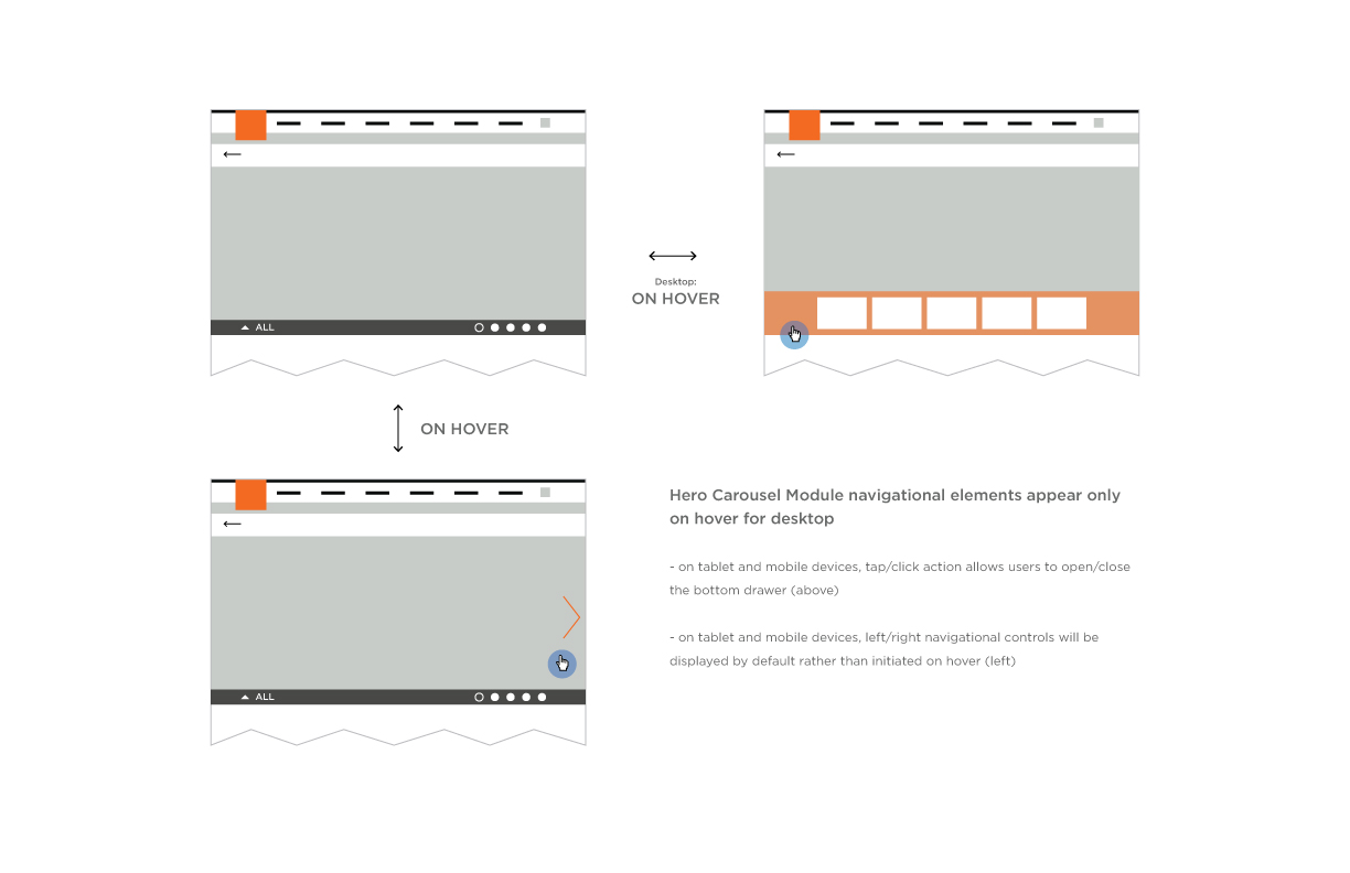
Reference: Apple Landing Page Carousel

A visual exploration of transitioning black and white photography to color upon user interaction with an element
(image size = 215 x 274 px)
A visual exploration leveraging large, full-bleed, black and white photographic style
For 'basic' work content items, when selected, they will display inline, pushing other content downward in a drawer-style interaction pattern
A basic conceptual wireframe of the content layout and design for the 'Contact' page in the new Team One website
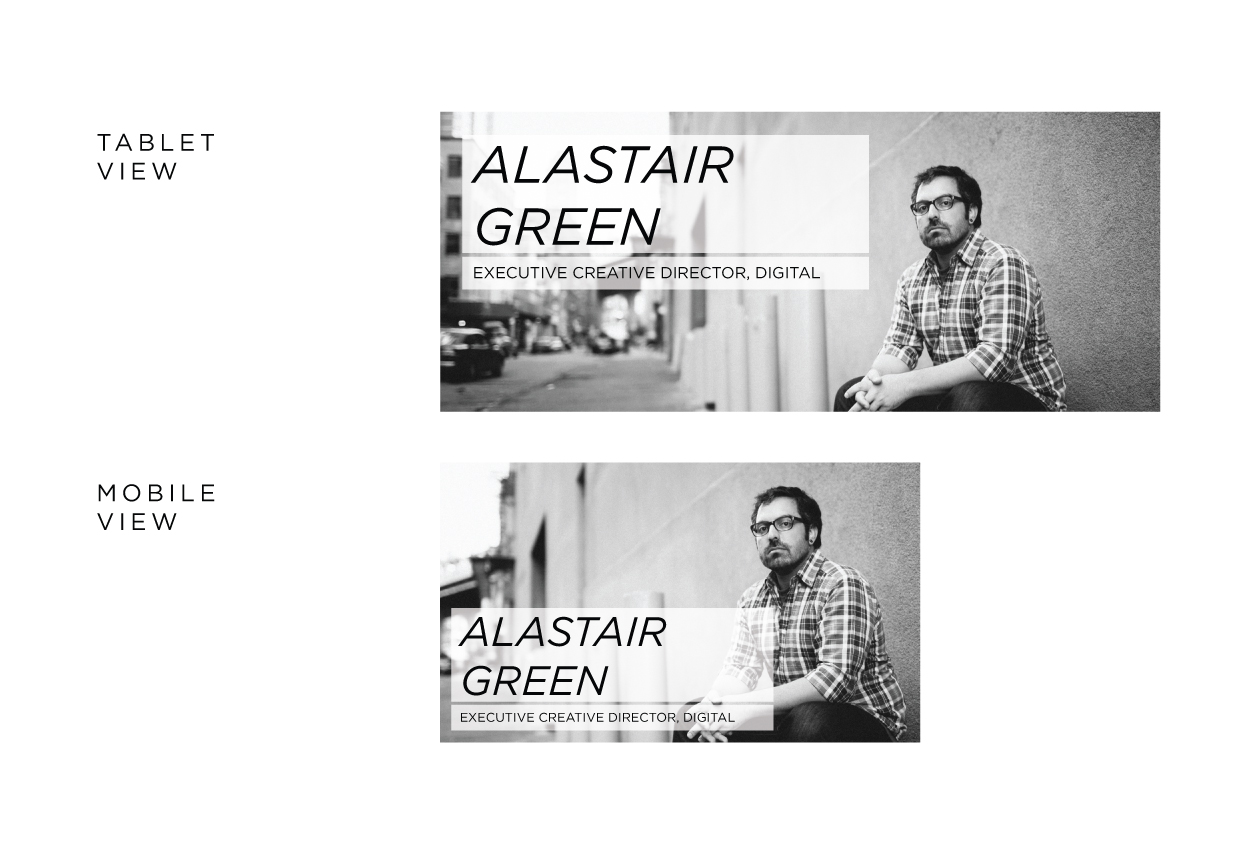
A basic conceptual wireframe of the content layout and design for the 'Leadership' page of 'The Team' section in the new Team One website
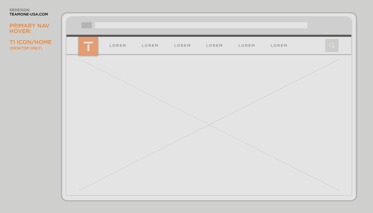
After reviewing with the team, we have selected this visual styling (below) for the primary and secondary navigation
Visual design exploration excercise for the primary and secondary navigation menus based on Team One branding and color guidelines
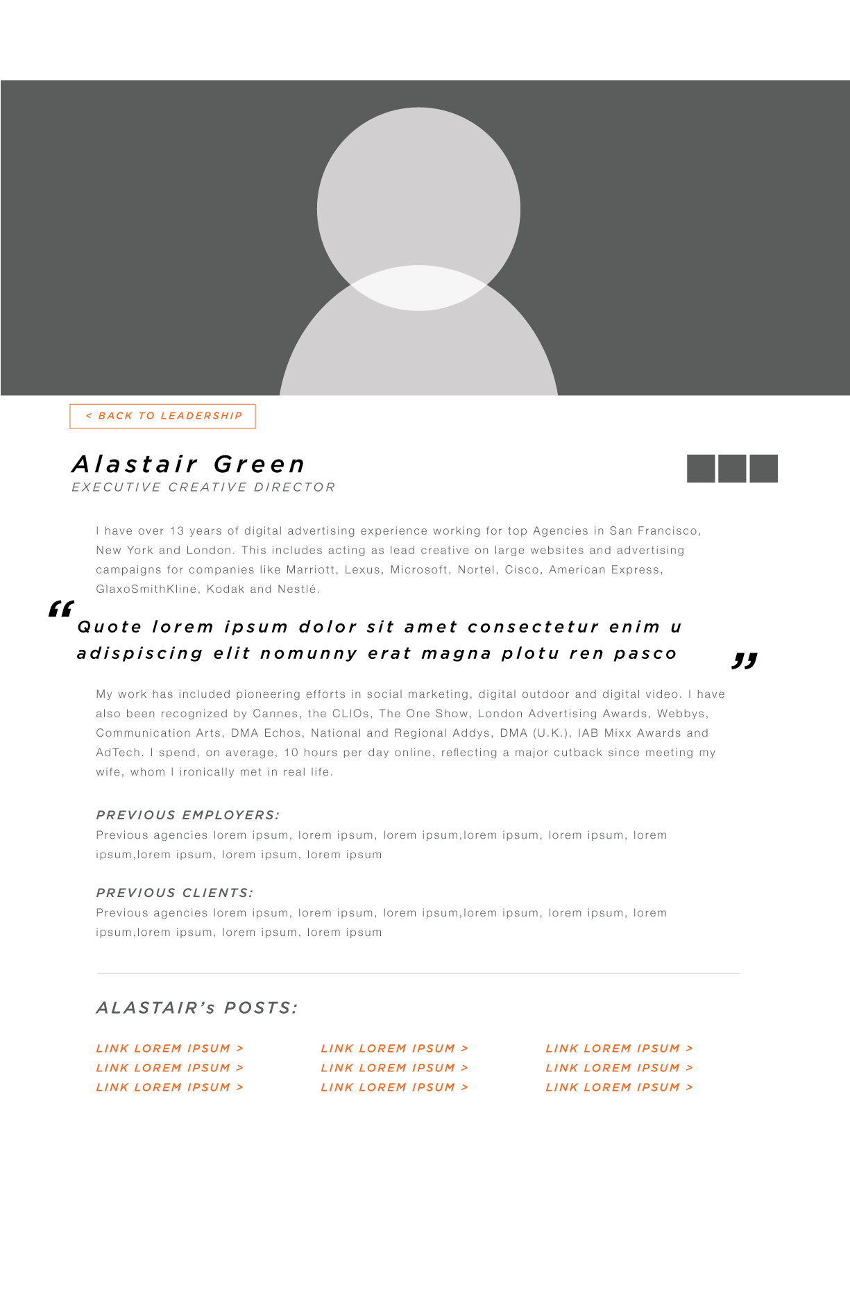
High level exploration of content layout and hierarchy for the Work section's 'Featured Case Study' detail pages
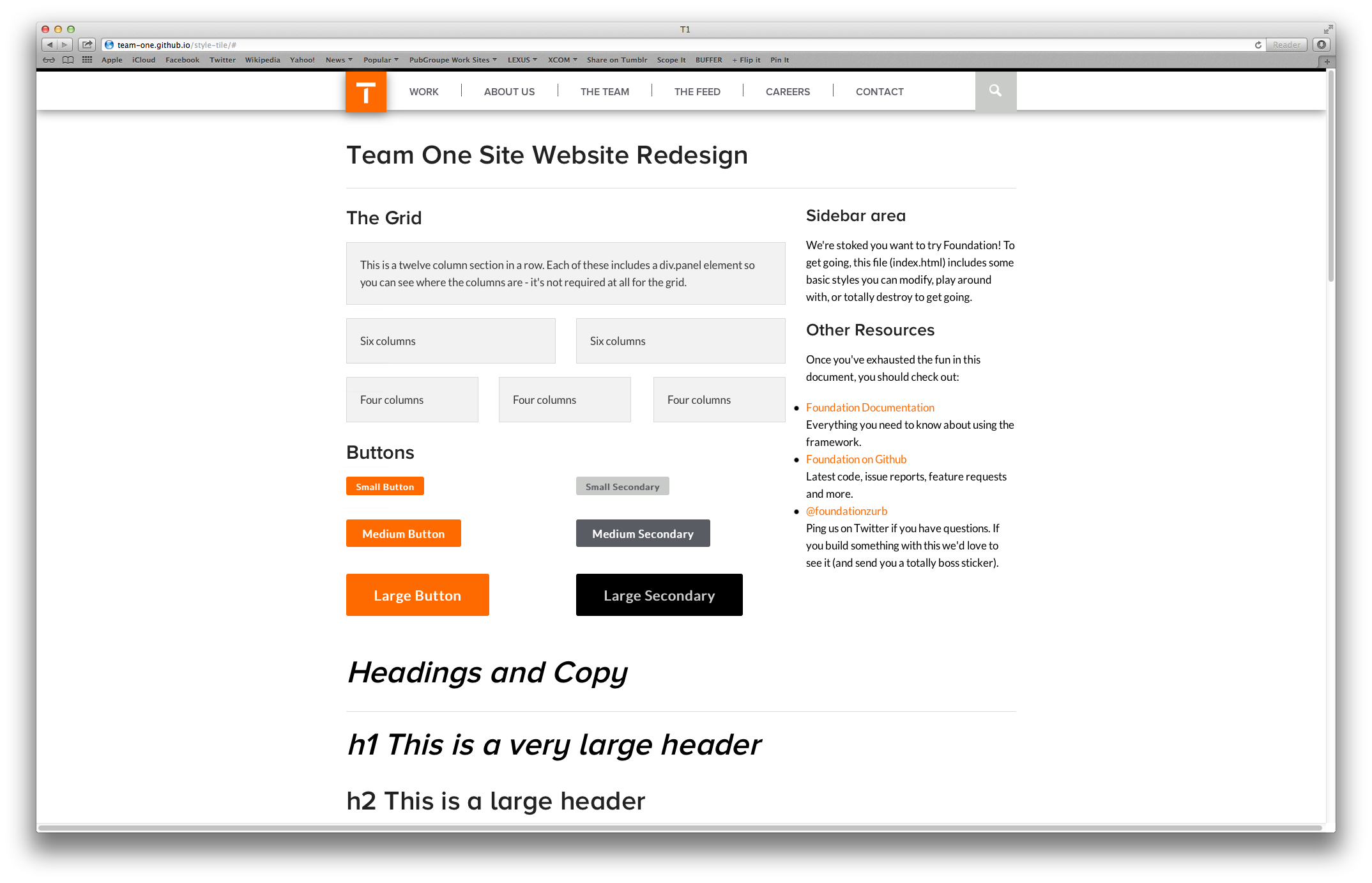
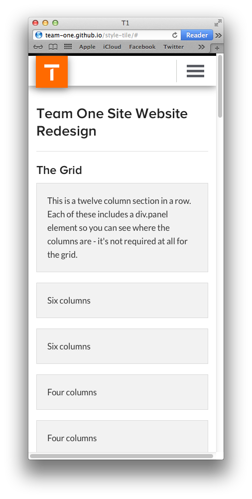
As we are working, we have been putting together our own version of Foundation's 'Kitchen Sink' in order to establish a working style-tile of sorts
VIEW THE TEAM ONE KITCHEN SINK ›(below: screenshots)
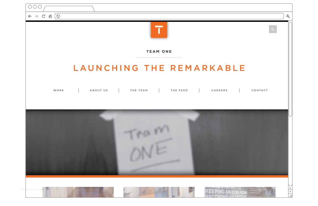
High level concept for the landing page experience - EVERYTHING BELOW THE NAV IS SIMPLY FPO
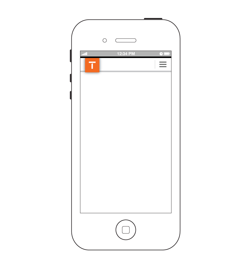
As a user hovers over the ‘T1 Icon’ in the primary navigation, the white ‘T’ will slide out of frame to show the ‘Home’ icon. This indicates to the user that selecting the link drives back to the global ‘Home’ page
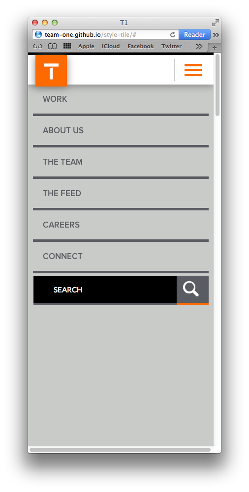
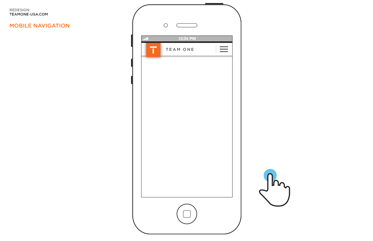
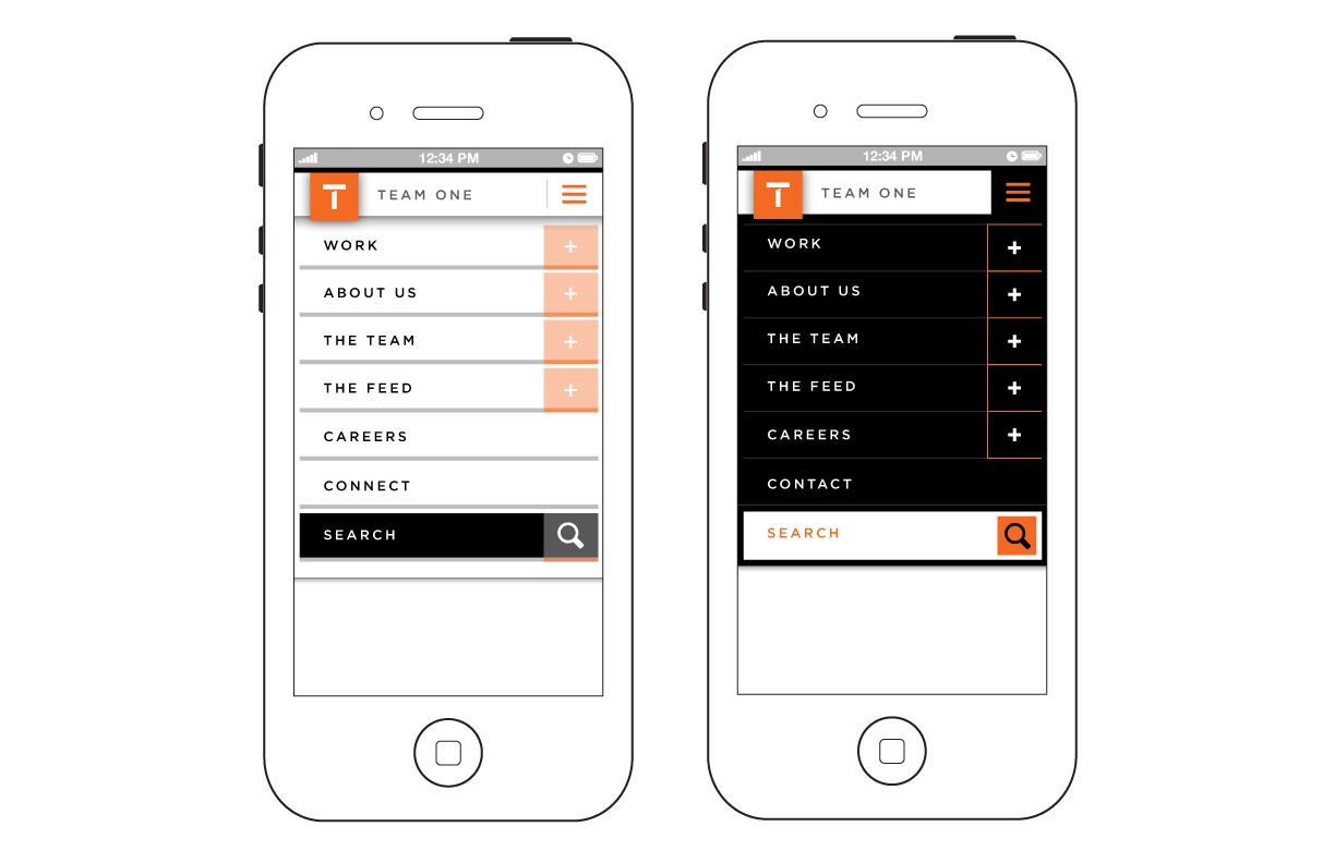
This animation shows basic functionality for the navigation system when viewed on a mobile device
The 'Default', 'Open', and 'Secondary-Open' states of the mobile navigation
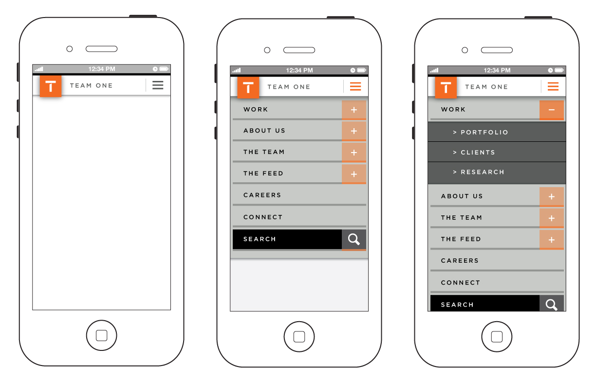
Alternative styling of the mobile navigation dropdown
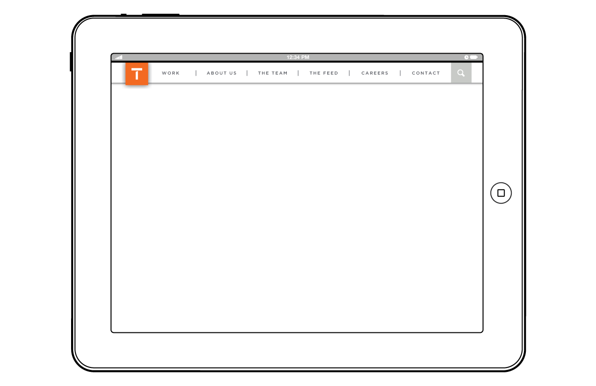
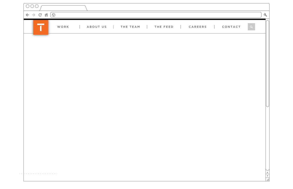
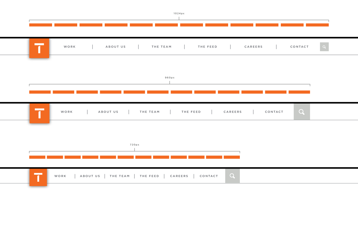
The basic layout of primary navigation on mobile, tablet and destop devices.
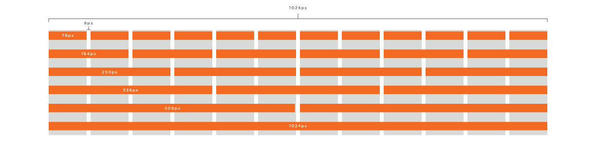
This is a visualization of the responsive breakpoints we will be targeting for desktop/tablet
Work in progress architecture
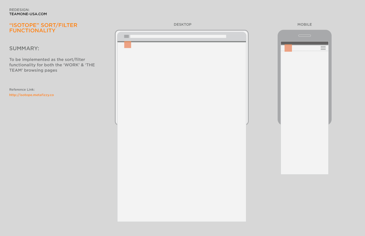
This is an example of the functionality that we plan to implement for the sort/filter capabilities on
Reference: Isotope on MetaFizzy
This will be a place where we post WIP (work-in-progress) content showcasing some of the design and development brainstorming, concepting, and, decision-making as we move forward. Although this is not a blog, like a blog, the newest content will always be found at the top of this page.
Reference: Isotope on MetaFizzy